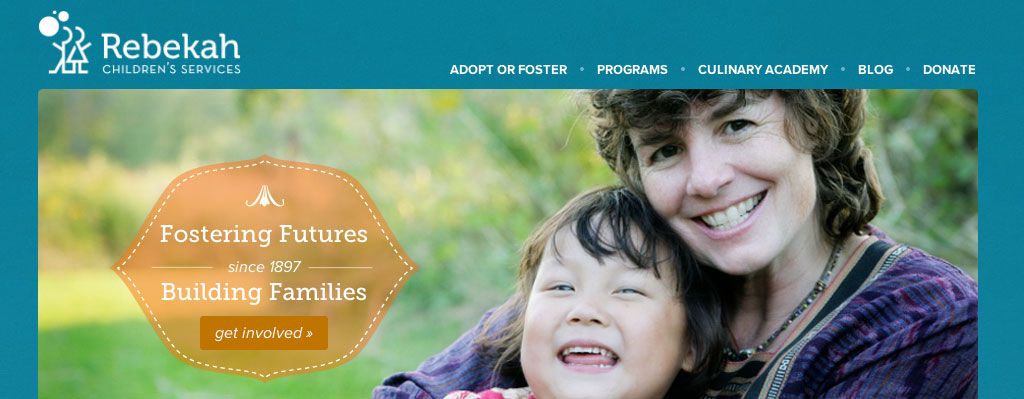
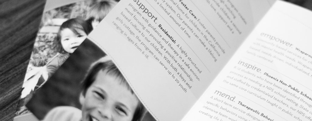
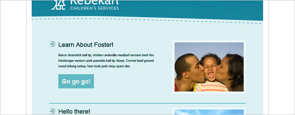
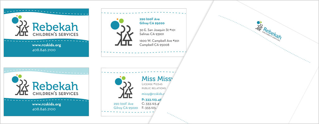
Rebekah Children’s came to us because their old site didn’t really convey the good that they do and, in their words, was a "visual train wreck" that broke all the rules for what a good nonprofit website should look like. They also needed a new look for their brochures that was eye-catching, consistent and provided people with information about their services. Our goal was to create a visual look that conveyed clearly Rebekah Children’s purpose and services clearly in both print and web materials.
"We couldn’t be more grateful to have had opportunity, and I’m glad that the ZURB team enjoyed themselves as much as we did."
Melissa Driscoll, Development & Community Relations Manager, RCS
"The RCS team was super dedicated and worked with us late into the night to create something great. No sleep was totally worth it."
Anthony Tadina, Designer ZURB
Rebekah Children’s Services was our winning nonprofit in 2011. Before coming to ZURB, people had been confused about what it was that Rebekah’s actually did and why. One of the reasons for that confusion had to do with the nonprofit’s website, which they referred to as a "visual train wreck" and "breaks every rule of what a good nonprofit website should look like."
Now Rebekah’s is taking the logo we designed for them and slapping it on all their materials. They’ve even rebranded themselves based on the designs we came up for them. It’s amazing that the materials and new site that we were able to hammer out in 24 hours is still sparking Rebekah’s and influencing their marketing materials, everything from business cards to marketing giveaways.
Despite the tight print deadline, the web design team didn’t waste anytime, doing an audit of the old site and sketching out the lo-fi wireframes for the new site. Using Foundation 3, the team was able to whip up the scaffolding on the site, which got us quickly to doing the visual designs once we met our print deadline.
See all the Photos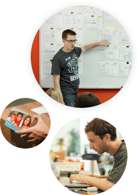
You're well on your way to collecting all the cows! Either check them out now, or click on the cow in the footer!
Check it out