When Hornblower — the harbor tour boat line — sent out an RFP for a marketing site for their next big thing, we were eager to jump into the race. "Excited" doesn't really describe how we felt when we won the project. Working on a consumer-facing site for a well-established brand was something we could sink our creative teeth into and do something disruptively awesome.
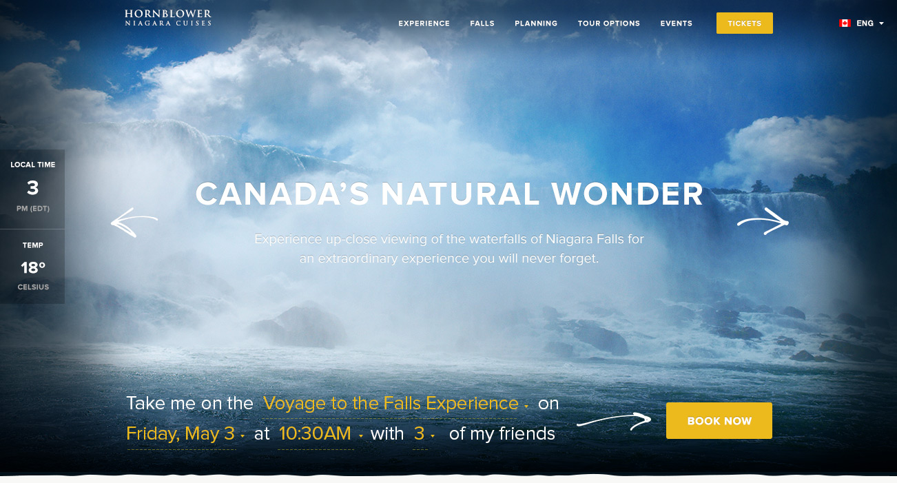
Besides operating some very fancy tours and dinner cruises, Hornblower runs two very successful sightseeing excursions — soon to be three! Their Alcatraz and Statue of Liberty cruises are some of the best known attractions. Next year, Hornblower is adding an incredible new experience to their fleet: a Niagara Falls cruise. They've teamed up with the Niagara Parks Commission to create an immersive, unforgettable attraction that's sure to delight any and all visitors. With that in mind, we set out to create an experience that put the customer right there in the middle of the action.
Showcasing the Tour and Grounds
Imagine for a second the glorious power of the Falls: the water engulfing you as it splashes on your face. That's the exact feeling we were working to capture on the marketing site. Our main goal was to recreate the experience of being out among the Falls in all its glory, short of actually spraying water from the browser. Every idea we toyed with was meant to bring the viewer further into the experience and make them regret not actually being there.
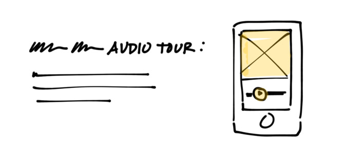
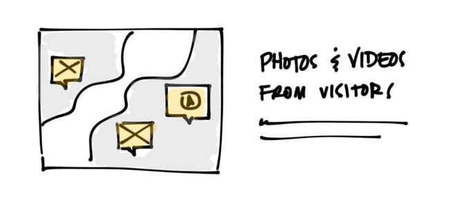
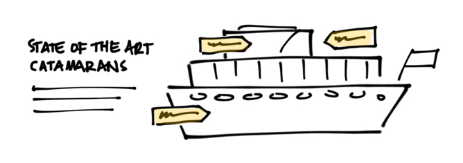
We set our sights on designing a super-rich web experience from the get-go, which was one of the key objectives for the Hornblower team. We explored using gigantic scenic photos (and probably a video in the future), the tour's route, an interactive map of the grounds and a schematic of the tour boats. We also played around with, and incorporated, a ton of user-generated content to bring even more life into the website. Photos, comments and tweets from actual Niagara Tour visitors became key elements in our layouts. After all, nothing is going to sell this amazing experience like the experience itself.
Identity Beyond the Website
We also placed additional emphasis on branding. While we made sure the site attracted curious travellers, the Hornblower branding team kept an eye out for design elements they could adapt for their off-line presence. Over the next few months, they'll be building out the launching pier for the tour and the entertainment grounds around it — restaurants, shops and relaxation spots. We also talked a lot about translating typography onto billboards and, believe it or not, the color of those waterproof ponchos!
Sounds like a lot of stuff out of our control, but that's not exactly true. We really had a lot of influence on the mood of the whole place. For starters, a lot can be done with just color. Use dark colors — the whole place feels sophisticated and polished. Linens, grays and whites are your sweet spot? Then you're going for a minimal look. Go for a bright palette — voila, you're in a happy getaway.
Our color scheme ended up being rooted in the natural beauty of the Falls, which was the only inspiration we needed. We used a sky blue and a forest green, then accented them with a splash of gold yellow. Moving forward, the Hornblower team will be producing collateral and furnishing the grounds with a style inspired by the web style guide we put together. Check out the color palette we put togehter:

Building for One, Designing for Three
While keeping focus on the Niagara Falls experience, we held Hornblower's other two successful attractions in our periphery. We knew that the plans outlined in this project had to later hold up for the other two attraction.
As new sparks came up, we'd ask ourselves: "What could we do for the Alcatraz tour here? Would this work for Statue of Liberty tour?" Anything that wasn't going to work across all three attractions was left behind. We only moved forward with concepts that could be replicated across all three attractions over time.
Because the stakes were quite high — we were designing for three experiences down the line — every element of the design had to hold its own and be something the Hornblower team could feel conviction in. We were certain that a design direction we called "Sensory Overload" was the right approach. We put together a mood board of expansive photos, bold typography and punchy color palette, but nailing down the layout details proved challenging. Something just wasn't jiving for the Hornblower team, and we couldn't put our finger on it.
To get us to the finish line, we packed our laptops and met the team on their office-boat in the San Francisco Bay. We sat down with them for a couple hours to work together through fine-tuning the nitty gritty details. Together, we amplified the typography, opened up the whole page by removing most of the containers, tweaked the color palette and finalized imagery used in hero areas. After all, sometimes "great image" means different things to different people. In the end, everyone was happy with the result, and we consider that a win all around.
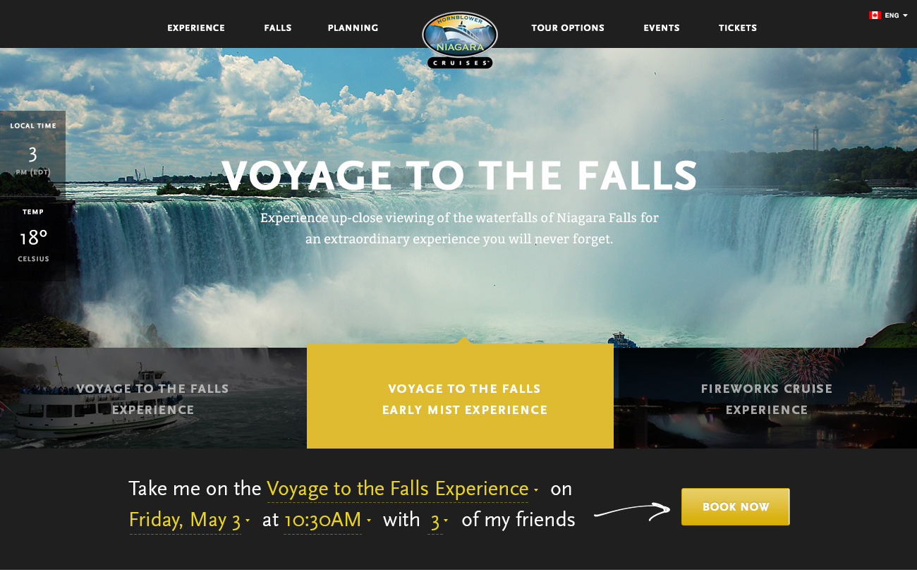
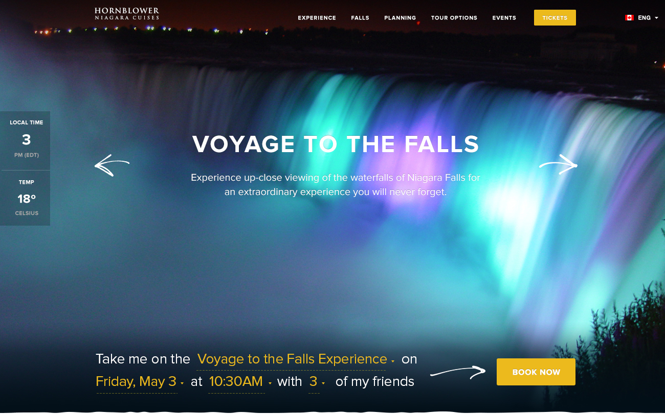
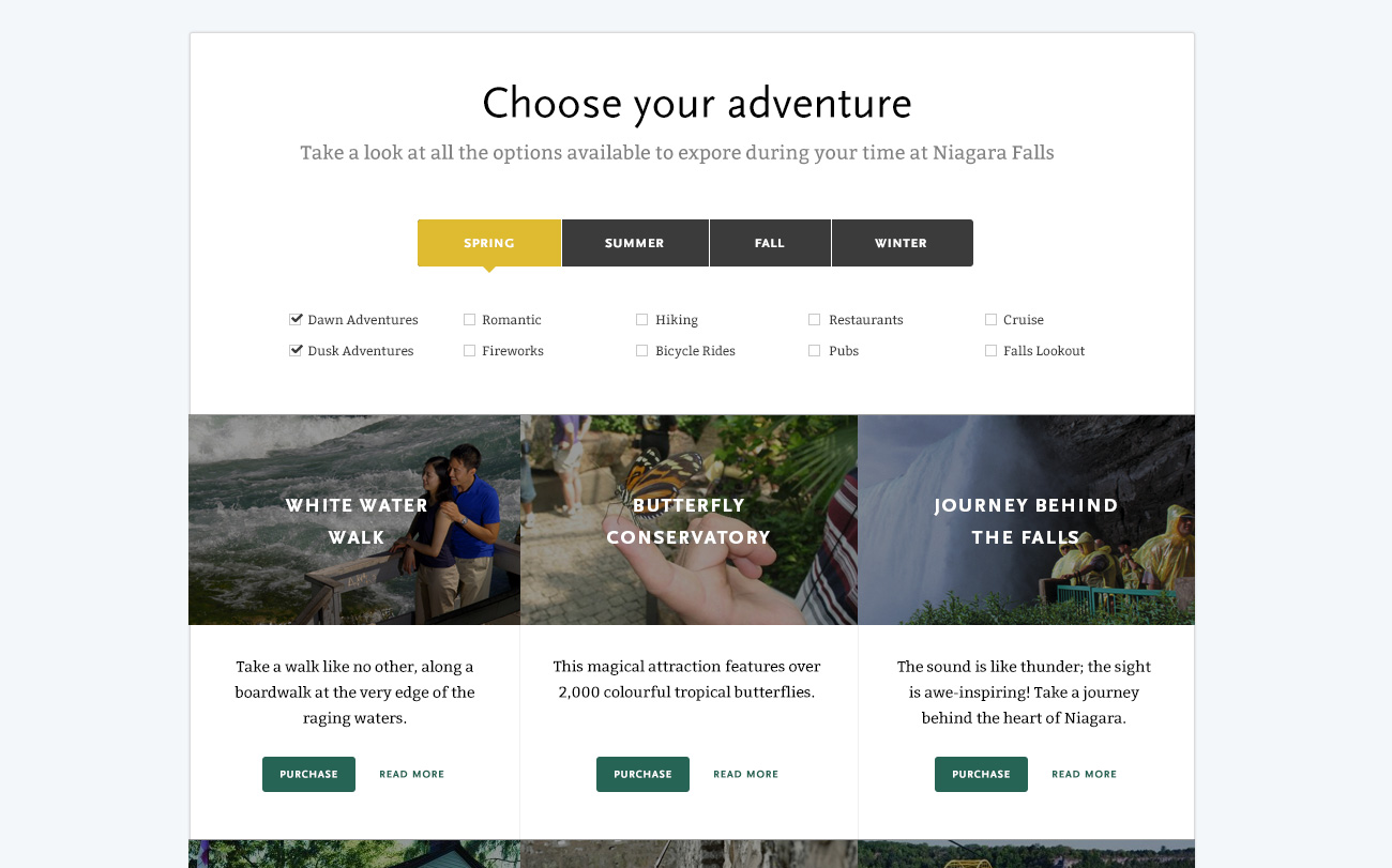
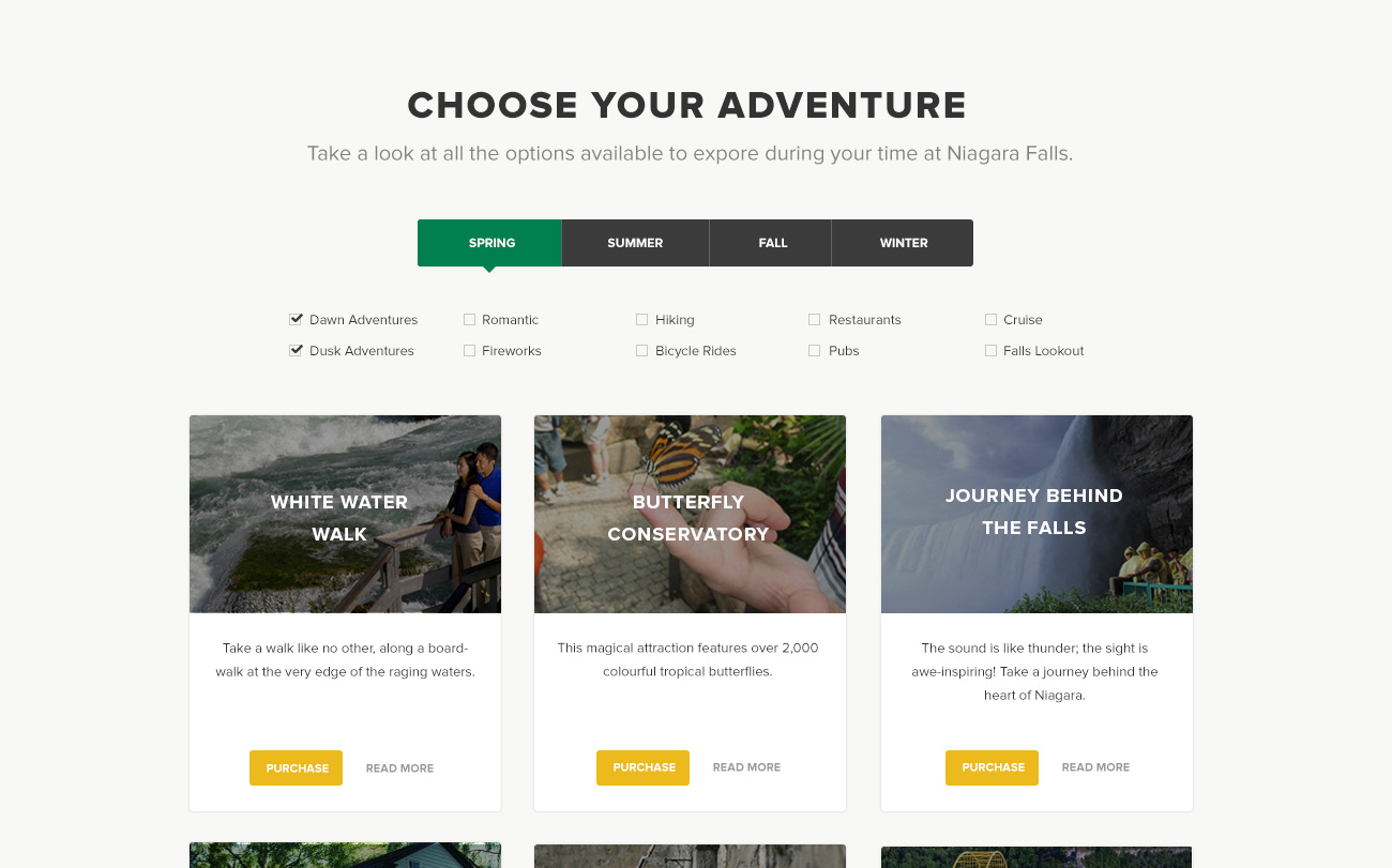
Here are a couple comparisons between the initial (left) and final (right) layouts:
Hornblower is launching Niagara Cruises next spring. We've helped set up Hornblower with a really solid pathway to unifying their three amazing tour experiences. We can't wait to see the site live later this year. And if the marketing site is any indication, man, we wanna go for a tour!


