Fact: We live in a multi-device world. Mobile users are skyrocketing and will blast desktop away very soon (like next year). There are hundreds upon hundreds of mobile devices on the market. While it's possible to design for every device by designing responsively (and we know you are), it's not possible to test every web-enabled device on the market.
Consider this, HTC alone has 12 different screen size and resolution combinations on Android alone. And that's one of the simpler line of Android products. Think about Acer, Motorola, LG, Sony Ericsson or the 25 other manufactures of Android phones. Then you've got your iPhones, iPads, Blackberries, Windows phones and Kindles. There's the OS to consider for each device. Conservative estimates put the number of web-enabled mobile devices at 6,500 (it's probably more). Of course, there's still desktops, laptops and all the different web browsers out there. Yeah, that's a lot of devices to QA.
If we had every device on hand, we'd have stacks and stacks of them from floor to ceiling piled up around the office. There's no way we can test all those devices, but we can certainly test a breadth of them to get a sense of how our designs would look on the different devices and operating systems out there.
And as designer Stuart Robson points out, there's no reason you can't at least test on the devices you own and you should do just that.
Not All Devices, A Sampling

Around the office we have some 12 different devices that we test our designs on, which we've acquired over the years. Here's a quick rundown of devices we test:
- 2 Windows phones
- 4 Android phones
- Kindle Fire
- Motorola Xoom
- 2 PCs
- Our iPads (with retina display)
- Of course, our iPhones as well
- A Mac loaded with virtual machine (which has Chrome, Safari, Firefox, and IE 6, 7, 8 and 9 on Windows XP or Windows 7)
Lots of designers test an iPhone and think they're all set when it comes to mobile, but that doesn't work. A design might stack well on an iPhone, but be mucked up on an Android-based device. You'll see that some things fit. Other things won't. Or that the navigation function works well on the iPhone, but breaks on the Android.
It's much the same with the iPad. Testing solely on the iPad doesn't mean that your designs work for all tablets. The iPad's 9-inch screen size is hardly the standard when it comes to tablets. There's 10-inch screens (Samsung's Galaxy Tab), the 7-inch tablet (the Kindle Fire) and 5-inch tablets (Galaxy note). There's also numerous different resolutions, even at the same size sometimes.
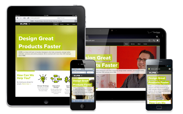
That's why we chose this sampling of devices because they give us the widest breadth possible to see how our designs would look across the different device platforms and browsers. Which came in handy when it came to testing how the new ZURB.com would look on different devices, especially when it came to tweeking how it looked on the different tablets.
One nifty thing we found with the Kindle Fire is that if you view something in portrait, it gives you a close approximation of a cell phone view.
'Future-Proof' Designing
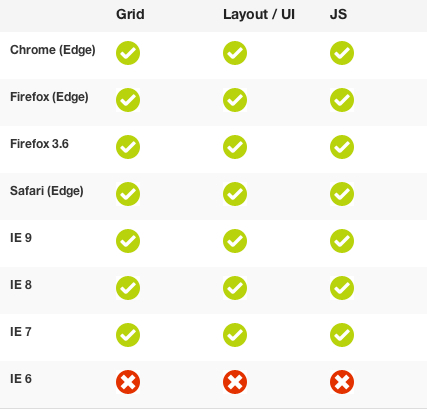
As we said, you can't possible test for every device out there. You can, however, design with those devices in mind. This is where responsive design comes in handy. That's why we built Foundation, which we're kinda partial to and use to build out our designs. Rather than testing every single of those some 6,500 devices, a responsive framework helps us focus on devices representative of each OS and device, like the ones in our list above. With those devices, we then test for the following browsers:

When it comes to mobile (and you're testing for mobile, right?), we test:

We also use our Mac that's loaded with virtual machine so we can test for IE and Firefox on Windows-based devices.
But using a responsive framework future proofs our designs, allowing us to design for not only the variety of devices available today but those still yet to come. That's because we can't possible test every single device, but we sure as heck can test a good sampling of them.