Four years after initial launch and six versions later there are millions of websites, apps and emails being created on the Foundation family of frameworks. Foundation 6 has been re-coded with an emphasis to take users from simple and quick prototypes to efficient and well maintained production work. As we roll into the launch next week, we're excited to share our insights on how we're looking at Foundations place within your company's style guide.
We traveled the globe, have worked through 500+ projects with Foundation and have a team of dedicated designers battle testing this every day. We struck an amazing balance in Foundation 6 for those designers and developers who bravely create, own and maintain a frontend framework in their companies. We put the designer and developer first...after all, you're the people that need to drive the change in their organization. We want you to quickly creating scaffolds with presentational classes, style your brand without overwriting code, and convert your styles and layouts into maintainable pieces. We want you to go from prototype to production.
Design as your Differentiator
Lately, we've also seen that frameworks have begun to tip far, far (far, far, faaaarrrr) in the direction of overly opinionated visuals. Simply put, they just have too much default style, which in turn means your site will end up looking like someone else's. This is great if you're building a Salesforce app with a Salesforce framework, or a Microsoft office product with the Fabric framework. Not as great if you're building a unique brand where design will be one of your main differentiators.
The design community has seen a huge increase in klout as of late in both startups and enterprise, CEOs and VCs recognize that design methodologies that are implemented consistently across the company can make the difference between them and their competitors. Companies have turned to style guides to keep their brands consistent, a collection of common patterns and code snippets to help designers and developers keep their brands across multiple pages and products. It's this combination of both visual guidelines and coded components that bring real value to both design and development teams. Many of these companies are open sourcing their internal style guides into highly styled frameworks in hopes to get their design vision to the masses. At ZURB we believe a style guide should be by your company for your company.
Guided with Style

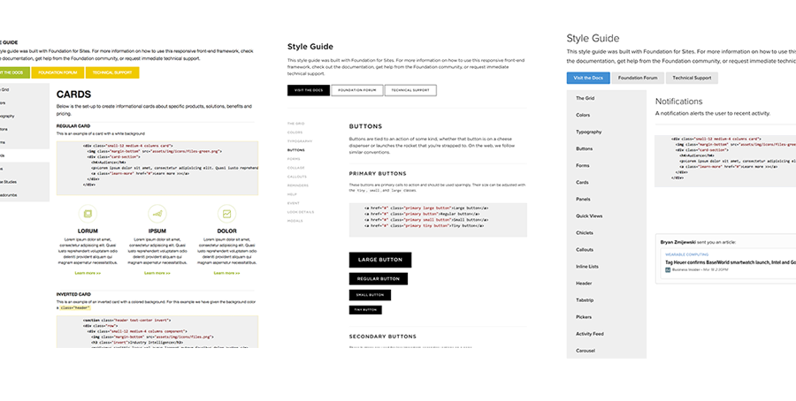
As a studio, ZURB creates design work everyday for clients of all sizes, stages and business sector and one of the most valuable things clients get from working with us is a coded styleguide. This is a collection of common components used in their product or marketing site that have been built on top of the Foundation framework. Some are modified from Foundation components, like tabs and accordions and others are custom components for a particular project.
Style guides are a great tool for large organizations to ensure their stylesheets stay small and their brand stays consistent. As a design driven company, this is why we've focused on creating such a minimalist framework, so companies can build on top without too many overrides. This lets your unique brand shine through and encourage less code bloat on your products. It's a win-win for everyone.
Foundation Launch Next Week
With our release next week we're so stoked for how Foundation for Sites 6 can help brands create your custom style guide that we're even adding a style guide template to our advanced development stack. This will let you use simple markdown and code snippets to generate style guides on foundation projects and it'll come ready with Foundations stock components already documented.
