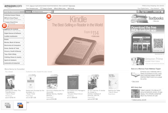
It's no secret that Amazon is trying to dominate the e-reader market with it's tremendously popular Kindle. It's also no surprise that the new homepage design TechCrunch first wrote about last week has removed most of the references to books on the new page, collapsed all other products into a single navigation item, and fronted up images of Kindles throughout the page.
Amazon is obviously testing this in a limited rollout, so we decided to get a jump on them and test it ourselves.
22% Decrease In Ability to Find Kindles On The New Homepage
Naturally you'd think that it would be easier for people to find Kindles on the new homepage. We decided to test this by using our tool Verify.
We asked 258 people to click on where they would browse available Kindle options on the following screenshots. Notice these screenshots below have red rectangles around the areas we defined to be the correct ones people should click on to browse Kindle options. The test takers did not see these red rectangles on the actual test they took. Here are the results calculated as percent of the 258 people who were able to click on the correct spot on the homepage to browse Kindle options:
So What's Amazon Missing Here?
There are a number of potential reasons people might not be finding the right spot to click on to browse Kindle options on the new homepage design:
A.) Featured Kindle image is smaller, less compact, and is slightly more crowded by the elements around it. The new design positions a very large ad right underneath the main Kindle image on the page. This distracts the user and splits their attention equally across the ad and the Kindle image. Some folks might even think the Kindle image is an ad.
B.) Primary navigation is hidden, making it hard for people to discover the Kindle in a list. The new design hides the main navigation into a single collapsable item in upper left hand corner. This leads to less people being able to find the navigation and browse through Kindles.
C.) The new design positions an ad that competes with the smaller featured Kindle. The size of the main Kindle image is much smaller in the new design. There is also less white space around the Kindle image. Both of these factors contribute to the Kindle image getting buried in the page.
Amazon is still just testing the new design. It's a bold move for them to remove all other products from the homepage and concentrate only on Kindles. They are betting on a future without physical books driving sales. Since they are already an industry leader in selling books online it might not hurt them too much to force people to click 3 times instead of 1 time to browse get to books. The trick of course is to make sure more people can find Kindles on the new design at the expense of removing other products from the homepage.
As always don't forget that you can run a test just like this one on your own homepage and see if people are able to find important items or information on your site before you implement a change.
Test Your Website '
