Last week, we highlighted how we have to solve problems at the mobile level if we're truly going to be Mobile First. This is something we've been thinking about for awhile now, especially when it comes to column grids on a mobile device and whether two was better than three.
Think about it for a sec. You're reading on your smartphone, but the content is crammed into three columns. It's cluttered, hard to read and it's even harder to tap on the right thing. We came across this very quagmire when putting together our new RSVP page for ZURBsoapbox. We were faced with how we would present the names of those attending on the page. Originally, we put together a three-column grid layout, but quickly decided this wasn't going to work.
Two-Columns Trumps the Competition
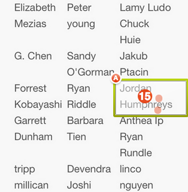
We felt that a three-column RSVP page made it really difficult to browse our guests' names. And it looked like a bit of a mess, with some longer names leaking out the sides of the columns. We pitted the two-column and three-column versions against each other. With a Verify test, we could see which variation would be easier to navigate.
There were a few things to consider. The two-column grid would make the page longer, so if you are looking to find a specific name on the list you will have to scroll much further down the page.
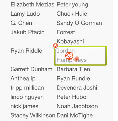
Using a Yes/No test, we showed half of our testers the two-column mock-up. The other half were shown a three-column variation of the RSVP page. Testers were asked to scroll down the page and click on the name of one of our engineers, Jordan Humphreys.
Verify Test Results (click images to view report):
The results were more definitive than we expected them to be. Testers were 18.41% more likely to find Jordan's name in the two-column grid despite his name being much further down the page.
Then we averaged the amount of time it took for our testers to find Jordan's name by looking at our raw tester data. We found that testers who saw the two-column grid located Jordan's name "29% faster in the two-column grid variation.
Without question, the two-column grid vastly outperformed its three-column counterpart. Two-column grids make it much easier to locate and navigate through content.
Selecting Two-Columns Over Three Isn't a Magic Fix
 Check out our Notable notes
Deciding a layout for your mobile page isn't as simple as choosing a two-column grid over a three-column grid. Sometimes this can go very wrong.
We recently came across Bleeding Cool's page on mobile. Their page isn't optimized for mobile and isn't responsive. Instead, it squeezes the entire desktop version of the site into its mobile counterpart.
On mobile, we are given the same two-column grid that we see on our desktop. In this situation, the two-column grid isn't a magic fix for mobile. It's cluttered, leaving the content with very poor readability.
How To Choose the Right Mobile Grid Layout
Cramming a whole lot of stuff into a tiny space doesn't work, except maybe for clowns. But this doesn't mean you can't have a lot of information on your page or a lot of articles. The idea is to choose the grid layout that will allow your content to thrive.
Just because some of your content is below others doesn't mean it won't be found. A longer page doesn't necessary mean it will take longer to find the desired content, sometimes it's actually faster! When creating your mobile layout, choose the grid that will best display your content, not what will make all of your content immediately visible.
However, two-column grids are better than three-column grids on mobile. They make your content more accessible, increase readability and make it easy to tap on the right thing.


