On our Studios projects, we spend at least two hours each week presenting the work we've done with clients. That's pure performance time. It does not include the time we spend doing the work, reviewing it, and then creating a compelling presentation. We're certainly not just sharing our screens and simply asking, 'What do you think about this?'
With our recent shift in the direction of Forrst, we've taken a hard look at what it takes to help designers become more successful in their work. Showcasing work isn't enough. Giving encouragement AND critical feedback is very hard to do. Without an honest view of design work, it's impossible to grow as a product designer.
Dribbble is Not for Critical Feedback
It's "show and tell" for designers, with more emphasis on the "show" than the "tell." Dribble does a great job of this. It fulfills an important part of creating something expressive — knowing that other people like and appreciate that work. One of the hard things about creative work is knowing that what you create may very well suck. Having a community where other designers can validate your work is essential.
Show and tell is for positive feedback. 'Hey, check out this awesome thing that I did!' It does not require context. It's a safe space. This type of show and tell is not the right place to get the critical feedback that improves design skills. There had to be someplace else that would fill that need.
Forrst was initially conceived as the venue to present work as more than a show and tell. Yet the work required of designers to do this wasn't something we were able to effectively foster within the Forrst community. We saw more and more Dribbblfication of design on Forrst, where work was being posted without explanation of the design decisions behind it.
Explain Along the Way, Avoid the Big Reveal
We present at every stage of the design process, every week, and explain the work we've done for our clients thus far. Why spend so much time on presenting and explaining all the design decisions we made along the way? It's not just about being Don Draper and being persuasive to sell the work. It's about educating people on product design and sharing our expertise.
For example, at the visual design stage, we will send over our work and then jump on the phone to present it. We'll explain the typography we're using and how it relates to the overall direction. We may also explain what typography we didn't use and why. Educating people puts them in a place to give better feedback and be your advocate in the future.
Presenting often and early also creates efficiency. You avoid having to go backwards and starting over when you get feedback on decisions early in the process. A traditional agency model might love the idea of getting paid to do the work twice. Sure, that creates more revenue in the short term, but the value the client is paying for goes way down.
Is this much presentation worth all the time? We know it is. We're able to validate our thinking every time a new person joins a project. They can quickly get on board, give us feedback without slowing things down or totally derailing the work up to that point.
Design Presentation is About Framing the Problem, Not Window Dressing

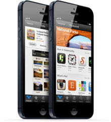
We don't treat design work as a car show. Presentation context is not about showing your design on a mobile device at a cool angle. Design Presentation requires explaining what the goals of the design were, and what was done to meet those goals. If the people reviewing the work don't know, or don't agree with those goals, they will give whatever arbitrary feedback they feel like because they feel they are compelled to say anything. Why? Because the interpretation is left up to them, as if it were abstract art.
Design is Not Abstract Art
Design work has a goal. Without understanding that goal, you can't give feedback that drives the design forward. You're not looking at a Jackson Pollock and explaining how it makes you feel, you're giving insight into how something can better serve its purpose.
On the other hand, the work posted on Dribbble is closer to art then design work. Take this geometric piece for example. It's presented without context and/or business goals. You post your work there to showcase it, and get affirmations from a community that it's good. Detailed feedback is totally subjective and not required, a simple like or 'Nice shot bro!' is all you need.
Forrst is Where You Become a Better Designer
Forrst was built as a place where you not only showcased your work, but you also opened yourself up to critical feedback. Think of Forrst as the gym where you go to work out, and Dribbble as the beach where you show off your rockin' body.
Getting critical feedback requires building a strong presentation that sets up the context and asks for feedback in the right way. This takes a lot more work than just uploading a screenshot, and was one reason Forrst didn't thrive when Kyle was no longer there to drive the community. Even if the work was great, but lacked a good presentation, it would not get actionable feedback.

Turning Forrst Upside Down and Investing in Presentation
In the new Forrst, we will focus on a single question each day. This will allow the team here at ZURB to curate the questions and ensure the presentation clearly explains the goals. The questions will be posed from members of the design community. One of the first questions we have lined up is from Joe Gebbia, founder of Airbnb.
This focused model is based on sites like Groupon or Woot. By highlighting a single (or somewhat limited) deal each day, they were able to create focus and more content around that deal. The result was a clear presentation of why you should buy the thing, and delightful content like quotes from Groupon the cat.
Be the First to Get Access
With this next iteration and renewed focus on helping people become awesome product designers, Forrst will operate under the ZURB.com domain and be officially part of the ZURB University. Do you have feedback or want to keep up to date with the next iteration of Forrst? Give us a shout on Twitter or request an invitation below!


