Let's be honest — as more and more people adopting smartphones, it's hard not to be a foodie. It isn't uncommon to see someone snap a photo of their meal to share with their social networks. When you're on the go, the mobile phone is normally the first place you turn to when you have to find a good place to eat.
It's been over two weeks since we released Plunk, our app for testing mobile screens, so hopefully you've gotten a chance to dive in and give the app a try. But if you're still on the fence over how the app can improve your mobile designs and speed up iteration, here are a few more examples of how you can use the app.
This week, we examined two of our favorite apps for discovering great local eateries (and the accompanying dishes that will make your mouth water). Let's dive into the tests and subsequent results.
Foodspotting
Foodspotting is a great app for discovering local dishes (and accompanying restaurants) around your current location. The app is visually-driven, which makes it enjoyable to use.
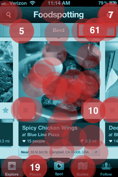
We tested to see if users understood where to go to discover amazing dishes close to their current location.
Here's the heatmap of where users plunked down (full report here):

It turns out that some users knew exactly where to tap — the top navigation button labeled "Nearby." 59 testers correctly selected this part of the nav (44% of the total tester group). Testers took approximately 5.3 seconds to make a decision; in comparison with last week's tests, this appears to be the average for a mobile screen.
19 users were led astray by the "Places" tab in the bottom navigation. The rationale behind this makes sense since locations are listed by distance from the current location in this section. However, dishes aren't listed on this page, only the restaurant names.
10 users selected the star button on the side of the dish. The app allows you to mark the specific dish as something you want to try, have tried or love, but it doesn't allow you to find other local dishes like the one you are viewing.
Ness
One of the fast-emerging apps under the food vertical is Ness. It brands itself as the "first personal search engine based on your unique tastes, preferences and personality."
And it sure delivers. Like Foodspotting, Ness features a beautiful UI and upon opening the app, hits the user with six different categories: Cafe, All Cuisines, Dessert, Pizza, Sushi and Chinese. A search bar dominates the center of the design, allowing users to directly input whatever dish or restaurant they may be looking for.
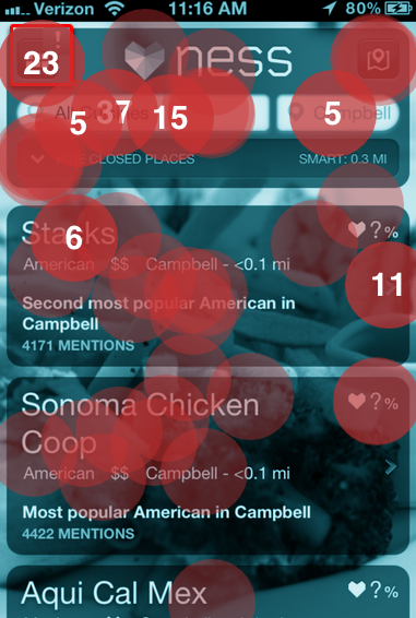
To test this design, we asked users to tap where they'd go to discover the best sushi restaurants — with a small catch: We started on the "All Cuisines" page.
Here's what we found (full report here):

In setting up this test, we selected the touch target for the upper-left hand main panel button (with the exclamation point).
Here's the big surprise from this test: Only 15% of testers selected the button! At first, it seems like a shockingly low number given that the home screen features "Sushi" as a primary category. How could users miss this?
However, 27 people selected the search bar with the cuisine name "All Cuisines" as preloaded text. This is an interesting finding: Changing the copy in the text box could potentially change the user action — in this case, significantly.
It's unclear as to Ness' preferred action here: the home screen offers a sushi category which simply lists out the local restaurants. The search bar works, but would take more time to select the bar, delete the preloaded text and retype the word. All in all, it's an interesting design challenge and one that Ness should seriously consider in future iterations of the app.
If you're interested in defining multiple touch targets to test and compare user actions, you may want to give