There's a lot of stuff on the Internet.
Think about it — how many mouseclicks do you make on any given weekday? If you work in any business with an Internet presence, it's likely that you click through hundreds of pages on a daily basis.
Delicious is a site that helps bring a method to the madness. If you come across an interesting or useful link, it's easy to store it in Delicious to find and reference it later.
We were intrigued when the Avos team launched the fresh redesign, but it naturally got us wondering — does the design help people effectively save and edit their bookmarks?
Does a User Know Where to Go to Add a New Link?
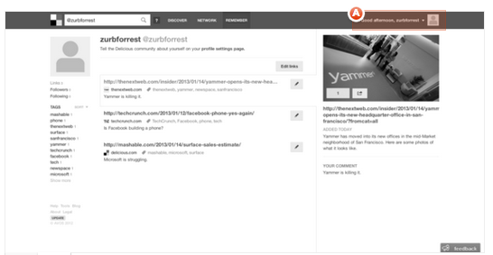
This past Tuesday, we released an initial test with a very basic question: does a user know where to go to add a link to Delicious? Given that it was the core function, it was very important for people to understand how to do this.

The Delicious team has updated the interface since this test — but the correct answer was a mouseover on the section defined "A" above.
Out of 76 responses, only 4% of responses clicked on the correct part of the design.
This was STAGGERING to us — how could 96% of testers manage to miss where to go to add a link?
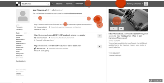
Luckily, Delicious flagged this as a problem and updated their "Remember" page with the text "Add A Link" in the upper-right hand side of the design. We dove back in with another test to see if this made a difference:

The results were incredibly improved: 77% of testers (35 responses) correctly selected the "Add A Link" text in the upper-right hand corner.
We're glad to see that Delicious made the shift, as it appears to have clarified a major point of confusion among their users.
Does a User Know Where to Go to See the Most Popular Content Currently on Delicious?
With more than five million users currently on Delicious, there's a tremendous amount of value in crowdsourced links. So do users know where to go to find the most popular content on Delicious today?

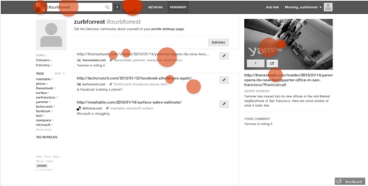
The results here weren't perfect. 64% of responses correctly selected the right link for the popular content — the Delicious logo next to the search bar or the 'Discover' link in the top navigation.
The right expanded story seems to generate minor confusion — potentially, the expanded story could pose as a headline, rather than more information on a specific link.
As far as popular content goes, Delicious seems to be well-positioned to share the best content on their network with their users. However, this is an area of improvement for them in their next design iteration.
Does a User Know Where to Go to Edit Their Bookmarks?
Given that some users have a lot of saved links within Delicious, we also wanted to see if it was easy for a user to edit a previously-added link within the "Remember" tab.
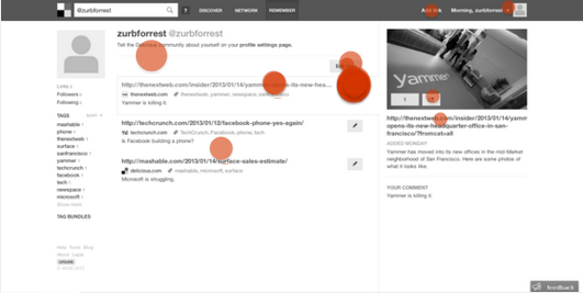
For the purposes of this test, we identified The Next Web's Yammer story as the bookmark to edit.

Delicious' editing capability passed with flying colors — 83% of responses were correct (43 responses). Each saved Delicious link has an attached pencil button, used to edit the specific bookmark it is attached to.
Our Conclusion
Delicious is a great option for those looking to save their interesting links found all around the Internet. Delicious' new redesign adds a pleasant interface to an already-solid service, and it passed all of our tests successfully.
The biggest opportunity for future design iterations is found in the Discover (or popular) content page. If Delicious can find a way to clarify where a user clicks through to find the best content on the site, it could turn Delicious into a powerhouse for the freshest and most relevant content on the Internet.
We're excited to see where Delicious goes in future design iterations.
