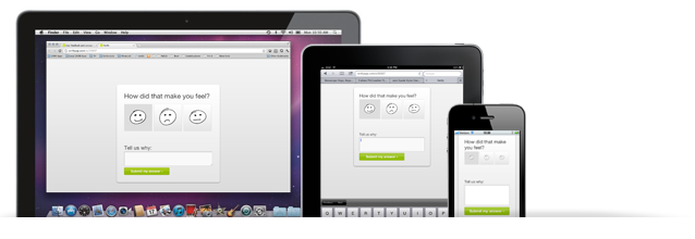
Last week, we announced that Verify now supports mobile testing, a very exciting milestone for us and something we feel is absolutely mandatory in our multi-device world. But when we decided we needed to support mobile testing in Verify, we couldn't just snap our fingers and make it work. First, we had to determine how we would implement for mobile in our app, with its existing codebase and styles.
We gotta admit that we were extremely proud of the look and feel of the Verify tests when we initially designed them. We wanted them to be fun to take, simple and very fast. That's why we wanted to keep the same visual presentation, as well as the simplicity and speed, when it came to making them responsive. That meant not discarding all of the design and making sure that survived the transition.
Enter Foundation
Verify was actually built on top of a precursor to Foundation called the ZURB Coded Style Guide. While that wasn't responsive, or even particularly full-fledged, it did mean that adapting our tests to the Foundation syntax was relatively simple. In lieu of fixed test screen containers, we went to flexible, fluid containers. Instead of using absolute pixel positioning, we positioned things based on percentages or floats so they can scale down gracefully.
Adapting the Verify test screens to Foundation was actually pretty quick work. But there was some complexity with the interactions that we resolved on a test-by-test basis. Check out a few of these sample test on your mobile and you'll see the level of refinement you should bring to sites or apps that you change over to a responsive design.
Responsive Isn't Just Layout
The Verify annotation test allows testers to draw notes on a mockup or screenshot by dragging to create a box. However, creating an actual annotation space (a box) on a small device doesn't make much sense. The space is too small (and fingers too fat) for this to be a good interaction. That's why for annotation tests we actually modified the behavior of the test based on the device size — in other words, testers now tap to place a note on a specific location, not to draw a box around it.
That was among the few changes we made to finish out the new responsive tests in Verify. All in all, we were pleased to be able to keep our existing visuals and interactions even while porting it over to Foundation and implementing it to be responsive. Check out the new tests (on your desktop, tablet, or phone) and let us know what you think!