You're out on the town with friends and you decide to find a place to eat. Whipping out your cell phone, you launch the Yelp app and scroll through nearby restaurants. Suddenly, you see it peeking at you from behind the menu — a hamster. You begin pulling the menu down to set it free only to watch the hamster jump into a rocket and blast off!
Did this funny easter egg help you accomplish your task? No. But did it bring a little joy or excitement to the experience? Definitely.
This kind of unexpected detail is an example of "Surprise and Delight," a design trigger that can make any experience more exciting and keep users engaged. Two talented designers recently came through ZURB HQ to get on their Soapboxes with different perspectives about surprise and delight and the role it plays in their designs.
Marissa Louie, of Yahoo, brought up the word "enchantment" again and again when describing her designs. Her goal as a designer is not just to provide a solid, usable interface, but to create an experience that connects with users emotionally. To accomplish this, she employs surprise and delight to create "sticky experiences" that keep users engaged and coming back for more.
On the other hand, Wesley Yun of Lytro was hesitant about devoting too much attention to unnecessary visual details. For Wesley, a designer's main focus should be making sure the product accomplishes its purpose. He warned that too much attention on extra details can actually harm the design, rendering it less effective.
So when should designers use this trigger, and how can they use it effectively?
Surprise and Delight Right
Surprise and delight increases satisfaction and makes experiences more exciting, but as with any tool, it needs to be used properly to be effective. Here are a few things to keep in mind:
Visuals Will Only Take You So Far
No amount of visual appeal can make up for a product that doesn't work right. That's why sketching is so important to us here at ZURB. Before we even write one line of code or draw one graphic, we focus on creating solid, useable and useful designs with Sharpies and paper. If something isn't working or doesn't feel right, we scrap the idea and move on.
If something is really working at that lo-fi level, we know it will be amazing once we add all the visual polish. It's only at that point where we start thinking of embellishing the designs with some surprise and delight.
Keep in Mind the Context
Meaningful surprises can make user experiences more engaging, fostering brand loyalty and encouraging customers to dig deeper into a site. But if you're not careful, surprises can disrupt the normal flow of activity, irritating users rather than delighting them.
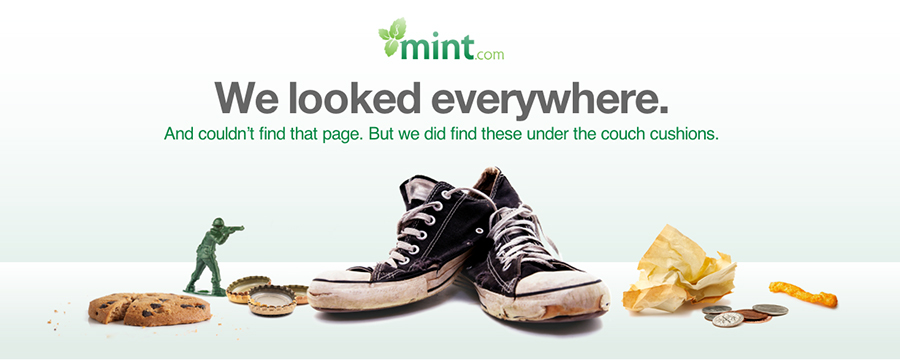
Mint, a personal finance website and app, does a good job of employing surprise and delight at just the right moments. It's typically a disheartening experience stumbling across a 404 page, but Mint softens the blow with this unique and humorous image:
Introducing some surprising element while a user was connecting their bank account or entering some important financial information would probably not be a welcome addition and have undesirable consequences.
The product itself may determine if it's appropriate to include surprise and delight, and to what degree. The customers that Wesley is designing for are in many cases using the Lytro cameras for work and have an expectation of reliability. For photographers, nothing can get in the way of capturing the perfect moment. Wesley called this the "can't fail" moment. In this application, a user would definitely not want any surprises. Distractions would be detrimental to the product accomplishing its purpose.
Marissa uses surprise and delight in Yahoo News Digest, an app designed to inform and entertain users. In this context, there is greater freedom to surprise users with unexpected details that turn an otherwise predictable experience into an exciting one.
Find the Right Frequency
Surprises by their definition do not occur at regular or predictable intervals. If the unexpected is expected, it loses its meaning and effectiveness. Experiment with the amount of surprises you include to determine what the right balance is. Sometimes less is more.
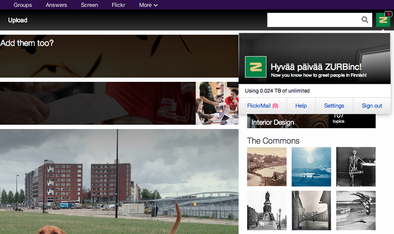
One site that breaks this rule is Flickr. Every time you log in you'll be greeted in a different language. While the greeting is expected, it's always delightful seeing it in a new language. Bonjour, Flickr!
It's Not All Visual
The amount of appropriate surprise and delight will vary according to the product and so will the format. Sometimes something as small as some playful copy or unexpected interaction element can come as a surprise.
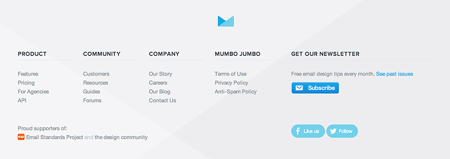
Normally, website footers are straightforward and stale, but Campaign Monitor catches us off guard with a bit of humor in their heading:
Surprise and delight doesn't have to be aggressive or blatant to be effective, subtle touches can be just as compelling.
As Always, Go With Your Gut
Ultimately, there are no hard and fast rules and it's up to designers to use their good judgement. The amount and kind of surprise and delight that will be effective largely depends on the product, the user and the goals of the project.
We want to extend a special thank you to Marissa Louie and Wesley Yun for sharing their insights with us at their Soapboxes. We're looking forward to our next guest, Braden Kowitz, Design Partner at Google Ventures, tomorrow at noon. We hope you can join us for what is sure to be another exciting Soapbox!


