The other day we came across this tweet from a fan of ZURB:
I want it to be Friday!! @ZURB @foundationzurb Foundation 3.0
— Ho (@imanthonyholmes) June 27, 2012
When we see a tweet like this, we can't help but say, "Heck yah, I love my job." And the truth is that we can't wait for Friday either. We're hard at work putting the finishing touches on Foundation 3.0. As Friday draws near, however, we wanted to take a moment and take a brief look back at the road to get here and give you a small taste of what's to come.
The Road to Foundation 3.0
Once released, Foundation 3 will be the most advanced responsive framework out there. And we've done a lot in the last few months to make it such.
We've also put in a lot of thought as to what goes into a modern grid system and how Foundation 3 could be the most modern grid available.
We've been ramping up to the Foundation 3 release by putting out new Foundation pieces on our ZURBplayground. In case you've been living under a rock, here's a breakdown of the stops we've made along the road to Foundation 3.
Foundation Font Icons

Several folks requested that we put custom icons inside of Foundation. It took some experimentation to create a font set out of vector shapes. Those experiments got us super stoked on the idea. We eventually designed a set of glyphs that were refined enough to stand on their own, but left room for you to play. The icons could be any size, color or style available in CSS. You can even use CSS text styles like shadows and gradients to make them feel less glyph-ie. Right now, this is an add-on for Foundation in our Playground and we'll releasing an update soon.
Get the Foundation Font Icons Add-On
Responsive Tables ... At Last

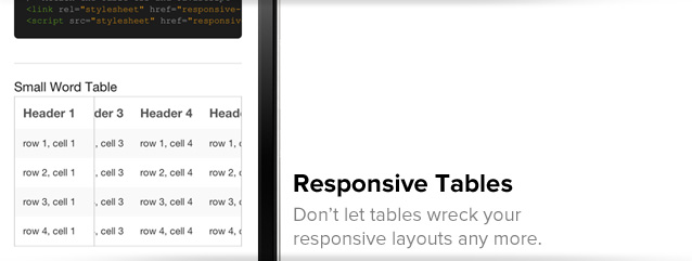
Large data tables have long been a pain to work with in a responsive design. They are prone to break because they can never overflow. The responsive tables that were out there didn't quite do the job either. So we created a responsive table implementation, which works within Foundation, that wouldn't break responsive layouts, doesn't unnecessarily hide table data and still allows you to compare rows with a key column. This is also an add-on that you can download now, which you can use with Foundation 3 (or the current version) once it's released.
Get the Responsive Table Add-On
Off-Canvas Layouts

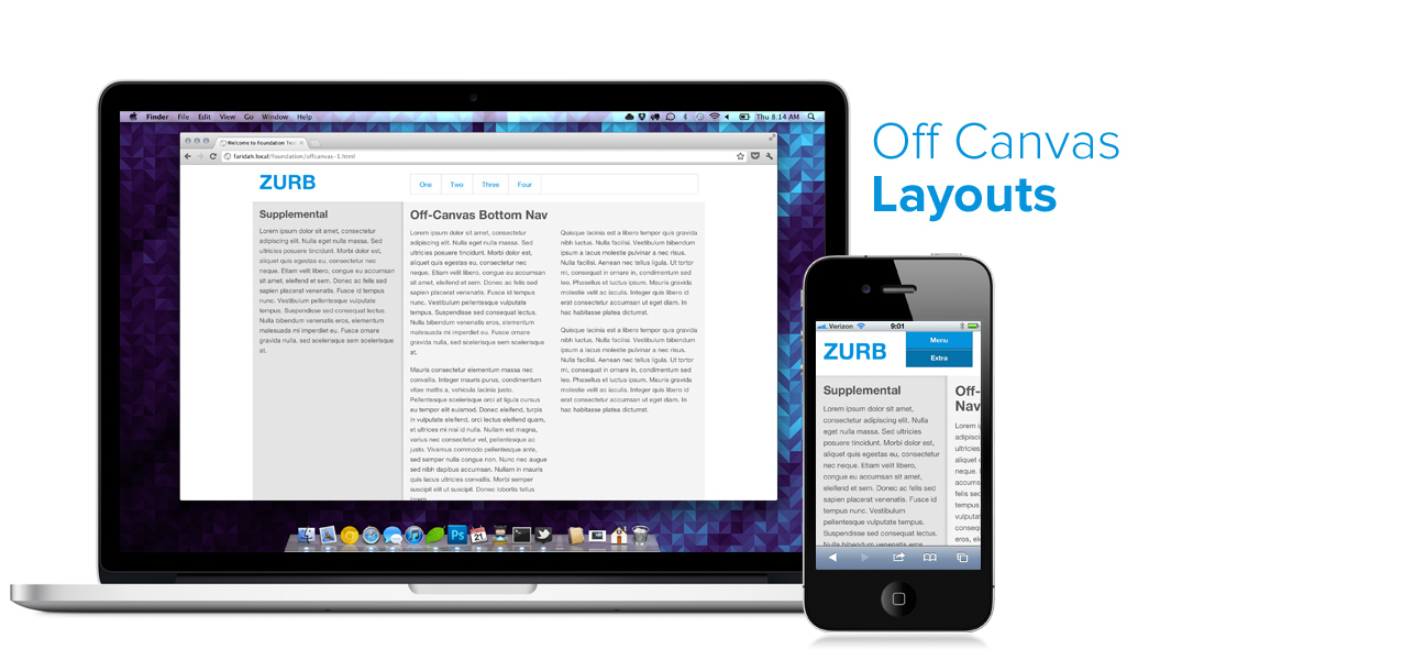
The responsive web will likely outlast native apps. The Web will take on more attributes of native apps, such as off-canvas layouts that you see on Facebook's app. In fact, our friends Luke Wroblewski and Jason Weaver came up with a group of off-canvas layouts for multi-devices. We worked closely with them to adapt Jason's code into Foundation, coming up with four patterns (bottom-nav, top-nav, paneled layout and sidebar nav). We restructured Luke and Jason's original layouts to use rows just like Foundation, meaning the markup is not only familiar but you can nest the grid within these layouts.
Typography and Modular Scale Collide
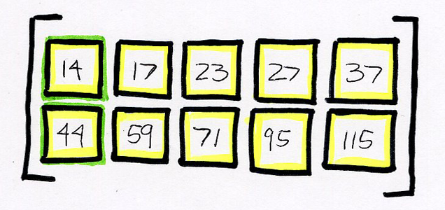
With Foundation 3, we've pushed what can be done with typography on the web. We even turned to a modular scale to revamp our type. Scales, from golden to musical fifth, have been used for a variety of things — architecture, writing, music and design. Modular scale, in this case, gave us a set of number to use. For Foundation 3, we choose 14px for our first number because it's a good base font-size for body copy. For our second, we settled on 44px because it's the standard for the smallest, easily tappable area for UI elements on small devices. Our ratio of choice ' the Golden Ratio.
 The actual numbers rounded from our scale for use in Foundation.
Since Foundation is being written in SCSS, we've used a open-source gem, aptly named, modular-scale. Using a modular scale helps us keep a consistent vertical rhythm down the page and a relationship between type sizes. Once you get your hands on Foundation 3, you'll be able to create pretty sweet typography for your project.
What's to Come
With Friday around the corner, we don't want to give away the whole kit and kaboodle. After all, we don't want to be accused of spoiling Christmas, so to speak. But we do want to give you a head's up as to what's to come. Here's a few things you can expect:
- New tab styles
- New button styles
- Semantic grid mixins
- CSS3 triangle mixin
- New UI Elements
We're really excited to be able to finally release Foundation 3 into the wild. Most of all, we can't wait to hear what all of you think about it and see what you do with it.
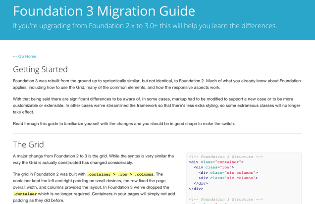
 A preview of one of the document pages. Click for bigger image.