Apple's new iOS7 is a great step forward full of useful innovations and a great visual refresh, but their work has been marred by the design details that people simply can't look past.
Tim Cook unveiling iOS7 to the WWDC audience. (Image from Apple)
The other day Apple unveiled a series of updates to their products and operating system to a room full of designers and developers, as well as to those clever enough pull up apple.com on Safari. While the updates to OSX, Mac Pro and Apple Air were met with open arms, the highly anticipated iOS7 wasn't. Some people welcomed the change. However, there was an overwhelming amount of people who told it to go back home (and they made sure to echo that sentiment via Twitter.)
iOS7 doesn't need to revert back; rather, it needs to take what it has and do some refinements before it launches this fall.
A Much Needed Evolution
iOS needed to update. We all knew that. When it was released, realistic elements were needed to familiarize users with the device. There had never before been a fully touch-screen phone. The little skeumorphic touches — such as popping the keyboard keys off the background to imitate an actual keyboard or a notepad with ripped papers — helped people understand what they needed to do.
It was intuitive.
Apple carried iOS's realistic visuals to the iPad, which, again, needed some familiarizing since its touch interface was a such a new concept (amidst critics touting it as the 10" iPhone). But how else would users instinctively know that turning a page in iBooks was as simple as swiping the page, similar to how you would in an actual book?
Flash forward to today. Almost six years later. Those skeumorphic details still exist, but we've been trained to use them. We know that, yes, we tap on things to select something, or that we swipe to move an item or progress somewhere further. These gestures are natural for the everyday user, so all those extra hints (look, it's a compass — tilt it to find where north is as you would a normal compass) aren't as necessary today as they were in 2007.
iOS7 — The Start of Something Great
When iOS7 was announced, we were ecstatic. This was a major facelift — a redesign worthy of setting new standards in the industry, and one that introduces much more intuitive gestures to some of the most common actions today's iPhone users do.
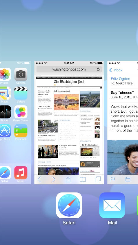
For example, to fully quit an app in iOS6, users must access the multi-task panel, tap and hold the appropriate app icon until the close "x" appears, then tap that "x". To fully quit an app in iOS7, users access the multi-task screen, find the appropriate icon, and swipe up. Changes like that may seem minor, but they're the ones that make a product go from good to great.
Everything in iOS7, from the thoughtfully crafted animations to AirDrop to the new icons, have been redefined, and we're huge fans. It's definitely the direction Apple needs to continue delivering delightful, highly-anticipated products to their customers.

Multi-tasking in iOS7 is more visual, and it's easy to switch to another app (tap), view open apps (swipe left/right), and fully quit one (swipe up). (Image from Apple)
But Those Icons … The Horror!
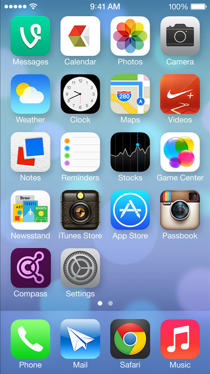
With every release, however, comes critics. Seconds after the announcement came a flurry of tweets proclaiming blasphemy in the form of the app icons. "They're too vibrant," "The gradients are too harsh," "What's up with Game Center?" Within a few hours and Dribbble was filled with solutions to these criticisms.
These were all valid arguments. The line work wasn't consistent, a few gradients were more severe than others, and, aside from the colors, the icons didn't feel like a cohesive set. But we think that's OK!
Think about it. If you own an iPhone, iPod Touch, or iPad, when was last time you only had the stock Apple apps? These icons will be living next to every other app you have (or in some folder anyway), and surely they all don't fit a single style and color palette. Vine's icon is fairly flat with a subtle text shadow while the Instagram icon is extremely rich in detail.
And hey, the Newsstand icon is a nice upgrade!

Example of the new icons mixed with other icons.
Wait, Look at That UI. What a Lousy Execution!
It's fair to argue that. While the interactions are more intuitive in this upgrade, the visual execution suffered a little. Apple's pixel-perfect, leather-stitched designs were swapped with a flatter, more streamlined design that came with a few flaws: visual weights of the icons aren't balanced, line weights vary too much, etc. "Simplicity is actually quite complicated," as they've noted. But it's Apple — we expect perfection.
That's where iteration comes into play.


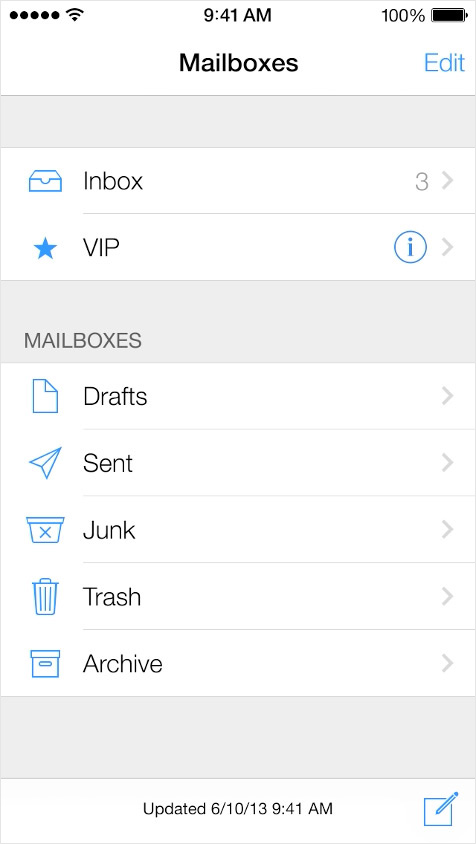
While the icons in Mail work nicely together, the back/forward arrows in Safari feel unbalanced next to the other icons in that tab bar.
iOS7 is out there for all of us to touch and test. Now Apple must use feedback from early adopters to refine the operating system before its fall launch. The interactions are there. It's the visual refinement that needs to be addressed.
You Go, Apple
To create [iOS7], we brought together a broad range of expertise from design to engineering. With what we've been able to achieve together, we see iOS7 as defining an important new direction, and, in many ways, a beginning. Jony Ive
Jony Ive sums it up perfectly. It's a beginning. It's a beginning of great forward-thinking design that focuses on users and thinks two steps ahead for them. It's a beginning of rethinking standards, and a beginning of a new voice emerging from Apple.
Everyone's going to have an opinion about iOS7. As for us, we fully support the direction Apple's going. We're all about pushing products forward to make them more usable, as well as to have their own unique voice. For Apple, that voice has been established with its iOS7 design (and that voice comes in male or female).
You go, Apple.
