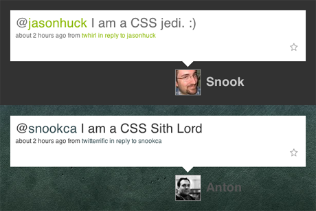
This morning, we watching as a few fellow nerds debated CSS coding styles on Twitter. Much like the whole tabs versus spaces debate that rears its ugly head when just about every designer and developer meet, CSS coding styles are often just as touchy of a subject.

Above, two of the big voices (Anton Peck and Jonathan Snook) in the CSS argument show just how nerdy such arguments can get. An argument like this might look pretty stupid or useless to most, but it's good that we can have them. It shows that everyone cares as much as we do about the craft as much as they do the outcome.
ZURB went through the same argument and ended up reaching a solution: one team, one style, one line. We try not to join the battle again and again, but we would like to explain a bit more behind what we decided and why.
That New Team Smell
Just like a new car smell, you want that new aura surrounding your team to last as long as possible. It's important that teams understand each others' work and styles. In our case, we wanted to have the same style, moving as one fluid, world-dominating force. Working in teams gives you a much different outlook than freelancing—you have to code for yourself and others.
The problem most people are quick to point out with any kind of coding style is readability, but let's all be honest here: a quick Ctrl+F or Cmd+F will do the trick anytime. We did realize, however, that scanning code was a key argument for the style we'd choose. We needed to be able to see larger blocks of code at one time to effectively use our CSS.
Experience Told UsHaving worked on several projects that require us to keep very large and often complex stylesheets, we ended up siding with a single-line approach. Be able to quickly see how a group of selectors work together is more important to us than a group of variable attributes. We still strive for consistency in those attributes, but our focus is on the bigger picture: simplicity and consistency within a team.
Consider the CSS snapshot below:

Although it's just part of our base styles we include in every project, it's a prime example of how we all work here at ZURB. Without scrolling, we know exactly how all of the typography on our project will render and interact with each other. In particular, take note of the h1-h6 section: see how easy it is to compare those and understand their interaction with one another?
No matter what your style is, make sure it aids you in your workflow. In our case, a team's workflow is more important and we all have learned to work with one style of coding. It helps us when one designer has to jump to an on-going project and has to pick up where someone else left off. Transitions are relatively seamless this way and it makes the team all the stronger.