Fun fact: the original Soapbox site was the first site we ever built with Foundation back in 2011. My, how times have changed. With Foundation 3 going strong and 4 building up internally, we felt it was time to update our flagship Foundation site, and rethink our strategy.
Rethink it with content first in mind.
Why the Change
Our Soapbox series features the brightest entrepreneurs, designers, managers, movers and shakers, in an intimate discussion with the audience about building great products and businesses, and the challenges and insights therein. Those fortunate enough to be close enough to Campbell get to attend these talks and mingle, chat and spar with like-minded folks. Those who aren't able to be here in person can listen to our podcast or read our summaries and takeaways of each talk, but our previous site design did not focus on this aspect.
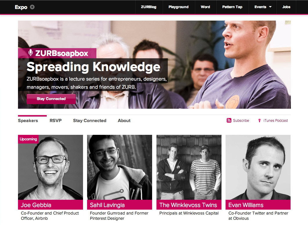
When we first started Soapbox, we wanted to bring in great speakers that we could learn from. Our home page featured an impressive grid of our speakers — enticing people through the sheer width and breadth of our alumni.

It worked. Soapbox gained traction, speakers wanted to come out to ZURB, and attendance stretched the capacity of our cozy little office. Energy's high at these talks — conversations about startups and products, people live tweeting from their phones, genuine laughs and thoughtful questions from the audience — we wanted people to be able to relive this, those who weren't there to be able to experience this in some capacity.
Our old site just wasn't cutting it. There's so much to be learned from each Soapbox talk, so we decided to bring this to the forefront of the redesign.
Getting Ideas Out With Sketches
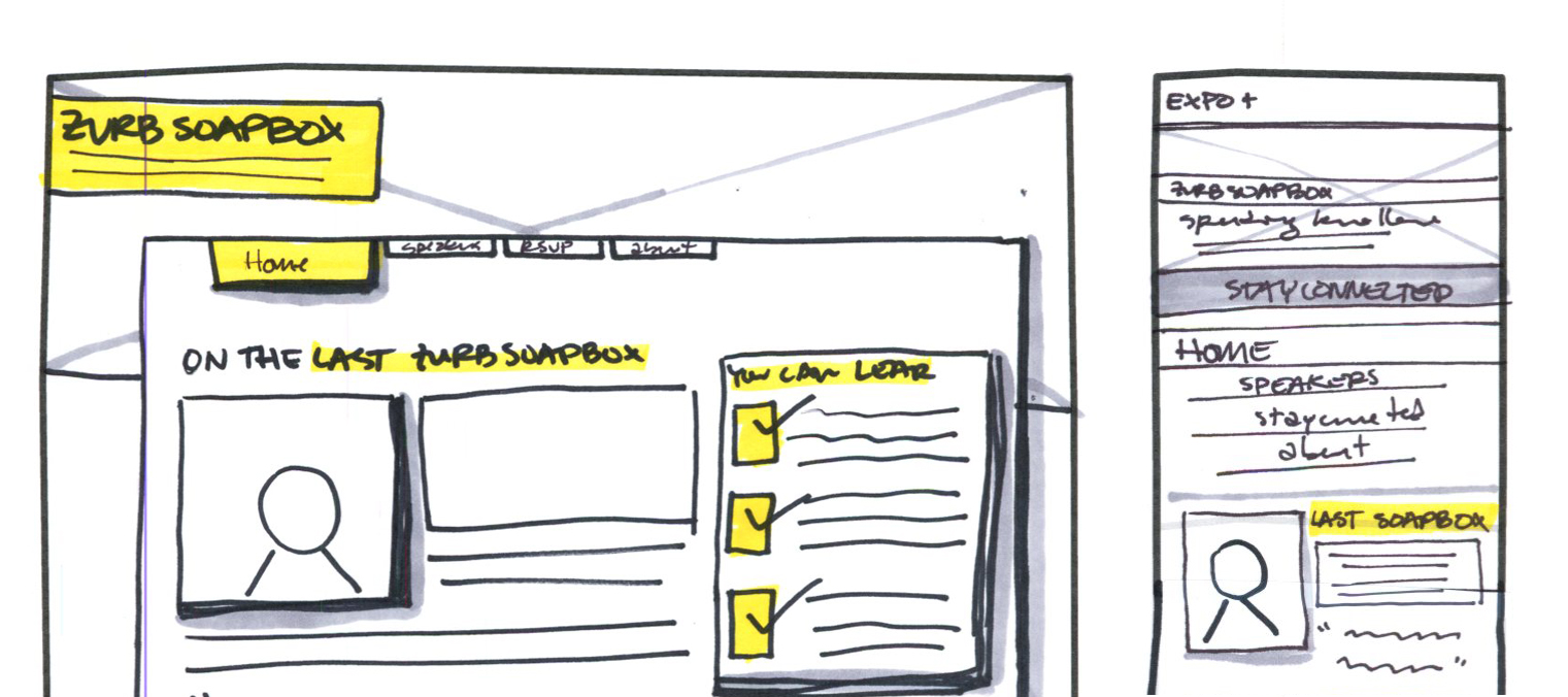
We started this project like we start all of our ideas — lots of sketches. We sketch to get lots of ideas out quickly. We went through a number of ideas, all focused on how to bring the content of the talks to the core of the site. We wanted users to come to the site and get immersed in the content and learn valuable takeaways from the site.

Our sketches helped us define what we wanted to present on the each page. The major changes were happening to the home page. We wanted to front-up a summary from our last talk, so users could immediately learn about all the great things that get discussed at Soapbox.
We also thought it would be valuable to summarize key takeaways from each talk, so users got a sense of the topics discussed for any given speaker. With each summary we also featured Tweet-worthy key quotes from the discussion so readers could distill some of the talk's contents with the speaker's own words.
Refining the Layout With Wireframes
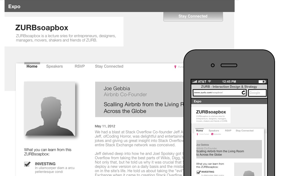
After sketching, we create hi-fi wireframes to nail down layout details, interactions, and flow. This stage helps us take our collection of sketches — full of ideas, features, elements, and disparate elements — and cleans them up, creating something that almost looks like the real thing.

We were able to figure out where areas were too cluttered and clean them up during this stage. Thick Sharpie lines are often forgiving when it comes to laying out elements, so the wireframing stage helps us get all of those things ironed out before implementation.
Pulling It All Together
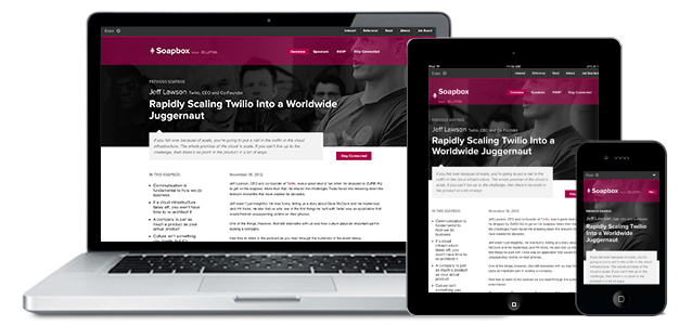
Structure nailed down, layout in place, it was time to create the site. We had a goal in mind to create a look and feel that was more immersive, and reflected some of the design thinking that went into the creation of the new ZURB.com. We've also been working internally on some exciting new things that we wanted this design to help pave the way for. What resulted was a clean, impactful design that took a step back to showcase the real star: the content.

With only a few key pages designed in Photoshop, we used the design patterns we established to build out the rest of the pages and elements in code. Foundation made optimizing the site across all devices a cinch, and we were able to quickly launch the site.
What's Next
This month, we're moving into a new building with a much bigger event space. We're excited to be able to open our doors to so many more guests. Along with this, we want to keep coming up with ways to innovate the site and bring content to users in meaningful ways.
We learned a lot from this effort that you'll soon see applied to other efforts, so be on the lookout for that! Here's are some takeaways of what we learned:
- Let the content drive your design. If you're a designer, you're probably too familiar with lorem ipsum. While it's helpful for designing a layout, it's not meaningful to the design. When you clearly understand what you are trying to say, and how you want users to consume it, you'll find that the design process can more easily follow suit.
- Highlight key takeaways. A takeaway about a takeaway, how meta. But seriously, if you have a content-heavy website, such as Soapbox, pulling out important points for the user helps them more easily scan the content and identify with what's interesting to them.
- Remember, it's only an iteration. We're constantly thinking of new ways to improve both the site and the event. Even though the new site is out there, we're still learning about it and will continue to push updates to make it better.
