(From left to right: CEO and Co-founder Boris Veldhuijzen and Lead Designer Alexander Griffioen)
It's always thrilling to find others who share our passion for design and aren't afraid to take risks. We've worked relentlessly since 1998 to establish ourselves as leaders in the industry and are constantly looking for new ways to improve and take design further. Our Foundation family of open source frameworks has helped push the web forward, University has trained thousands of designers around the globe, 300 of the most innovative companies in the world have partnered with us to build better websites, products and services through our Studios business, and our design platform Notable has helped our team and others create better products. In order to maintain this level of quality and innovation, we're always on the lookout for new inspiration which is why we were so eager to dive into The Next Web's bold new redesign.
Through several conversations and a Notable annotated set of screens, we asked Co-Founder and CEO Boris Veldhuijzen van Zanten and Lead Designer Alexander Griffioen some tough questions about why they made specific decisions, what kind of data was influencing their design and how the new design was helping them achieve their goals.
Bringing the Homepage Back from the Dead
Ironically, the thing that makes sites like The Next Web so much fun to read, constantly fresh content, is also one of their biggest problems. With new content coming in on a regular basis, sometimes by the hour, great articles were getting pushed off the front page and away from the eyes of readers.
We wanted to show more posts on the front page and have the option to move things around a bit and keep posts promoted for hours or even days. - Boris
For many publishers, the homepage is dead as most traffic goes directly to articles from social sharing and other sources. The team at TNW viewed this problem as an opportunity, the perfect place to try some new ideas and address some longstanding issues.
We feel having a single news stream with all content pouring in chronologically no longer makes sense. Tech has become too ubiquitous for a single stream to be relevant to everyone, so we split our front page news stream up into categories. - Alex
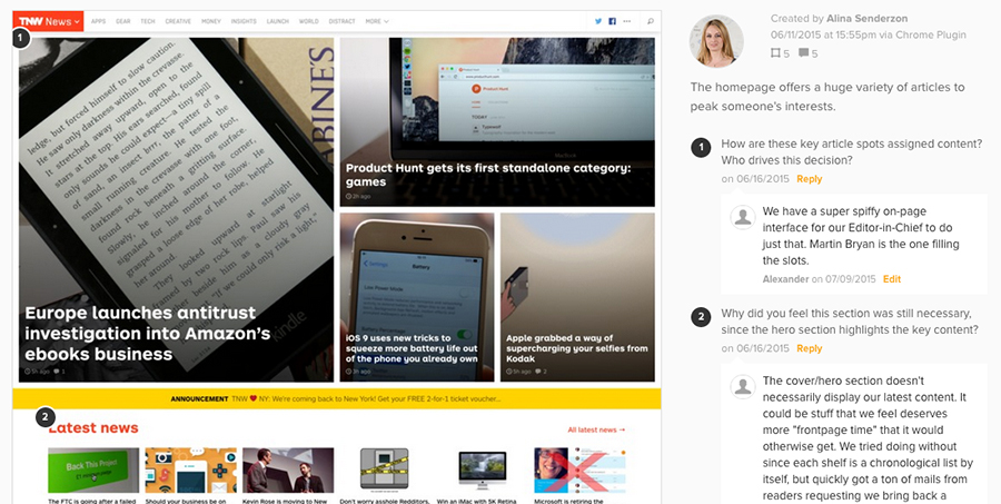
One of the first parts of the redesign that Boris and Alex started sketching out was the cover, an area that is so dynamic in traditional print but ironically stagnant on the web.
We found it striking that somehow newspaper publishers can completely overhaul their front pages every single day, yet us tech-savvy new media guys seem to be stuck with a single template. When Facebook acquired WhatsApp for $ 19 billion, didn't that merit a full-page announcement for at least a couple of hours? We wanted that freedom. - Alex
Boris, an ideas man, dreamed out loud of 'a Minority Report-esque interface that the editor-in-chief would resize and rearrange stories as they develop.' This novel idea inspired Alex and an elegant and versatile solution was born, the cover editor. Consisting of 6 pre-designed layouts, the cover editor gives editors the freedom to pick a layout that works best for the current news offering and fill the slots by dropping posts from the editor right into the cover.
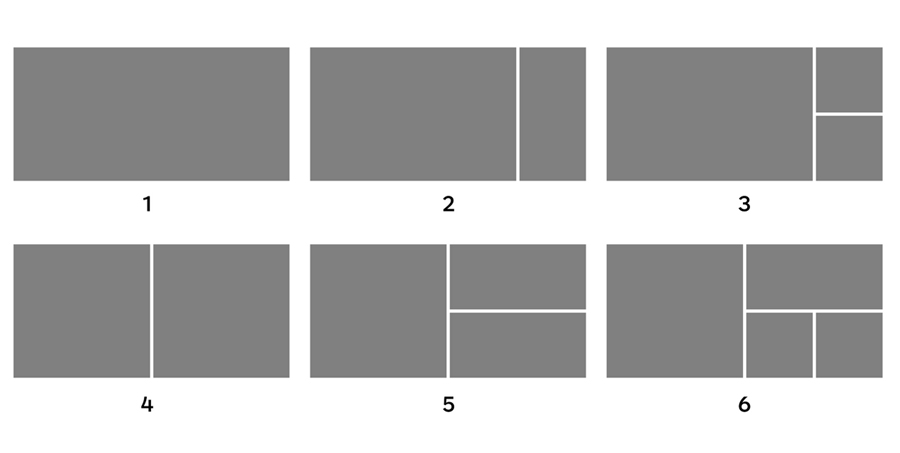
(The six predesigned layouts in the cover editor)
The cover/hero section doesn't necessarily display our latest content. It could be stuff that we feel deserves more 'frontpage time' than it would otherwise get. - Alex
The New Navigation Situation
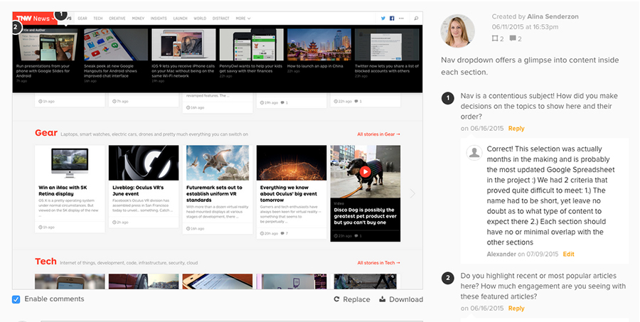
The Next Web is more than just a tech blog, they've got a wide range of other offerings that need to be easily accessible yet clearly differentiated to the user. The solution? A well labeled dropdown under the TNW logo.
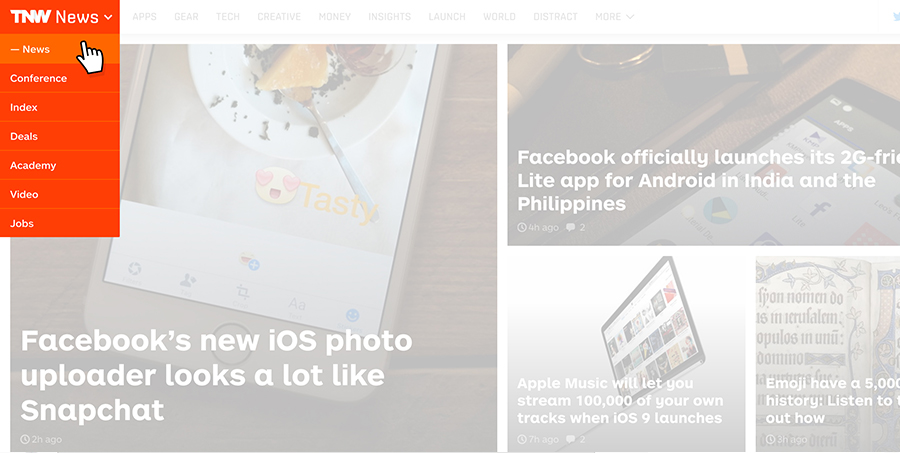
In addition to that main navigation component, all of The Next Web's articles are now divided into 9 categories, the naming of which are guided by two simple criteria:
- The name has to be short, yet leave no doubt as to what type of content to expect there.
- Each section should have no or minimal overlap with the other sections
Nav is always a contentious subject, and this was no different for the The Next Web team.
This selection was actually months in the making and is probably the most updated Google Spreadsheet in the project. - Alex
Content is King
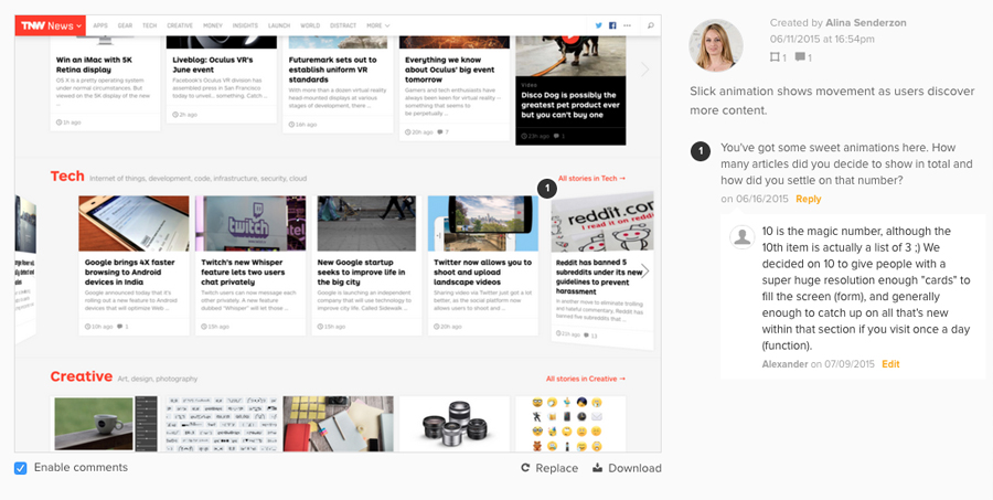
Ditching the content stream synonymous with the blog format, The Next Web divides their articles by subject and places them in neat rows they call 'shelves.'
Boris came up with the bookshelf metaphor; a horizontal list of latest stories. The irregular heights of the cards, akin to actual books on bookshelf, make for a 'pleasantly messy' UI. - Alex
Changes have also been made to the content in posts themselves. Instead of purely longform articles with the conventional title, image and body of text, posts can now consist of videos, galleries, columns, deals, quotes, etc., all represented with a distinct design that helps identify their nature.
Other design changes include a slick new sharing feature that automatically reduces the URL length and improved related article suggestions, but Alex is especially proud of of the updates in typography.
A typeface, to me, is like a voice narrating your content. The typeface determines whether the same words sound deep and masculine like George Clooney, or witty and quirky like Michael Cera. - Alex
Alex looked high and low for the perfect typeface, but the inspiration came from the strangest place. While riding past a Dutch employment agency, Alex spotted this window and fell in love. He snapped this pic and sent it to Boris immediately.
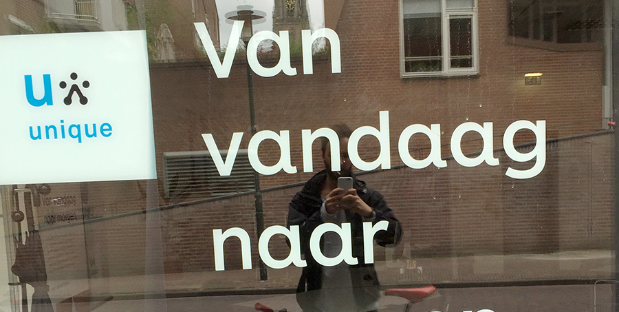
Serendipitously, the typeface is ARS Maquette by ARS Type, a one-man foundry situated a few streets away from TNW HQ.
I'm pleased to say our content now sounds like Bill Murray; witty, charming, and not without a sense of humor. - Alex
This passion for typography is shared among the team. Boris told us this hilarious story about a disagreement he had with the team about font size.
I remember I pushed hard for bigger font size on one part of the site, and after much heated debate I decided a certain font size really had to be 18pt and not 16pt. Alex hated it so much he talked to Laura and they made the changes as I wanted them but then every day from that moment on decreased that font size with 0.1pt. It was so subtle I didn't notice, but after 20 days it was at 16pt and we ended up launching the new site with that. They only recently told me about that and I thought it was hilarious and also very cool they really fought for what they thought was the better solution. - Boris
Ads That Can Be Confused With Art
A major challenge for any site collecting ad revenue are the size, location and behavior of ads. It's no secret that click through rates are dropping as people develop 'ad blindness' and use of adblockers rises every year. But more prominent or flashy ads take away from the user experience and can irritate users. There needed to be a way to increase the effectiveness of ads without being obnoxious. Boris was determined to figure out a solution that benefited everyone.
I challenged the team to think about an ad solution that was so cool that some readers would forget about the article they wanted to read because they were distracted by the beauty and interaction with the ad. If they would go so far as to even tweet about the ad we would've reached that goal. - Boris
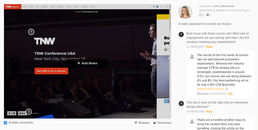
With that challenge issued and the goals coming clearly into focus, Alex and his team jumped into action. The solution is one of the coolest parts of the the redesign, a bold concept they call 'Canvas Ads.' These gorgeous images typically incorporate bold photography and occupy the whole background of the article. Many slide the article to the right to give the ad full attention. Each canvas ad has 4 triggers that bring back the content for users, giving it an interactive feel. An interesting detail are the social sharing buttons directly on the ad itself. We know what you're probably thinking, 'Share buttons on an ad!?!' But according to Boris and Alex, it's working. The trick is the ingenious way the ads are selected. The ads don't always display commercial ads; about half contain art and portfolios from artists The Next Web team chooses. There are a few reasons behind this:
This has three advantages: the first advantage is for those artists we promote. They see their traffic grow and suddenly reach millions of readers around the world. The second advantage is for our readers. They see beautiful art works instead of ads. The third advantage is that it encourages our advertisers to produce really good looking ads. They compete with artwork so their ads better be works of art as well. - Boris
So the ads look nice and all, but are they performing? We pressed Alex for some numbers.
The results of the first series of canvas ads are well beyond everyone's expectations. Whereas the industry average CTR for display ads (i.e. rectangles, leaderboards) is around 0.2%, our canvas ads are doing between 4% and 8%. Our best performing ad so far had a 15% CTR. - Alex
Shaping the Future
All said and done, the redesign took about 8 months. No change was made lightly, as the team debated over even the smallest details like the number of milliseconds for the transition of canvas ads. The redesign is bold and in many ways bucks conventions, forging a new path for online media. This thinking, to leave no stone unturned and not be limited by status quo was intentional.
Once you decide you are free to do what you want you can challenge everything and things like 'but that's just how it's done' provoke only laughter. We constantly challenge ourselves and our industry to forget the old rules and really think about the best solution for everyone. It can be daunting and scary to not being able to rely on the past, but it also means you get to shape the future. - Boris
A bold design backed by solid data, The Next Web redesign does a great job of balancing business needs with a solid user experience and puts content front and center. We want to thank Boris and Alex for taking the time to chat with us about their redesign and all of the insights they provided.

