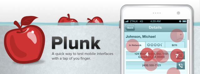
It's no secret that more and more people are using their mobile devices to browse the web. After all, mobile web traffic will blow desktop traffic out of the water real soon (sooner than originally predicted). And when we pull out our smartphones, whether it's an iPhone or an Android or whatever your preferred brand is, we don't have something between us and the content.
There's no keyboard. There's no mouse. The distance is as close as our finger tips. Think of it this way, as our friend and advisor Luke Wroblewski recently pointed out:
The content is the user interface.
Our fingers are the tools with which we interact with content on the page. Where our fingers land are sometimes not where the designer intended, no matter how delicately designed the buttons are on the page. Sometimes it can feel like bobbing for apples.
Bobbing for Apples: Introducing Plunk
Imagine for a second that you're viewing a website on your mobile phone. Maybe it's your bank's mobile site and you're trying to transfer money from one account to another. Just as you're about to hit the "transfer" button, nothing happens. You have to do it again. Or you simply can't strike it properly with your thumb or your fingertip. Worse, you hit the button next to it that says "cancel" or, at least, that's what the screen registers. It can be frustrating to deal with a site or product that is littered with buttons that are too small, delicately designed and too fancy for our fingers to actually hit.
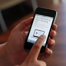
Touch targets need to be larger on mobile to fit our fat fingers. Let's go back to LukeW for a second. As he points out, we're designing for 10 mm touch targets. That's because, as he cites, studies have shown our fingertips are about 8 to 10 mm.
Anything smaller than that is a rotten apple. Just as poisonous to a product as the apple Snow White chomped down on. As Luke puts it, we have to fit touch targets within that 10mm range, maybe even go bigger with a minimum of 2mm spacing between the targets to avoid errors.
Knowing this and with the explosive growth of mobile, we pulled out a specific function in Verify and turned it into a mobile-specific test for touch targets, which we call Plunk. The new free app lets product designers see where users are really plunking down their fingers on a design.
The core of Plunk (pun intended) allows you to upload a mobile webpage or application design. You can then create a test by dropping a hot spot over the target you wish to test, and you'll get a reports page. You can read about the nitty gritty over on the ZURBapps blog, here.
But we thought we'd take you a little behind the curtain to see the magic of how we built Plunk, delving deep into the barrel.
Dumping Apples in the Barrel
Of course, when it came to putting the page together, we turned to Foundation. But the trick was trying to balance the technical aspects of Plunk with the fun theme of bobbing for apples that we came up with. We had three big versions. Check out some of the early sketches, compared with the final design.
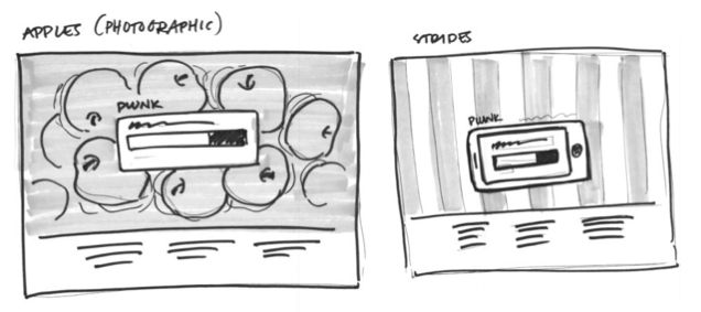 Some early sketches of Plunk's homepage.
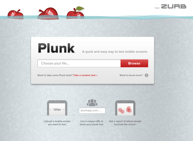 The final homepage.
Tossing Out Those Rotten Apples
We wanted the test to be as true to the original design as possible while still making sure that the images were representative of a phone's dimensions. After all, this is a mobile test so it has to look just right on mobile. So we instituted what we call the "Goldilocks Implementation."
What that means is that there is a minimum and maximum width, which represents all the reasonable phone sizes. That means that any image uploaded within that range will be pixel perfect, so long as the tester's screen is large enough. When displayed on desktops, a phone chrome is placed on the image, which scales using the old school sliding doors technique. So images that are smaller than the minimum, they are scaled up to the minimum.
When it came to uploading images, we achieved a cool water effect. But it took a little bit of trial and error using a server side image processor. The final settings ended up looking like:
-colorspace gray -fill "#89dbea" -level -10 -modulate 90 -tint 100
Another important aspect of the test is the hotspots, or red targets, in the test results. These actually let you know where users' fingers have actually landed on a webpage or app. To add the hotspots, we actually used the same annotation javascript code that we used in our other apps, such as Notable. Check it out below:
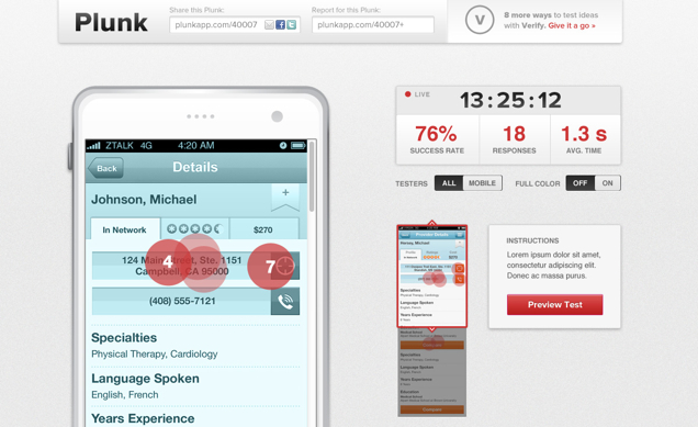 The reports page with the cool water effect and the red hotspots.
Knowing where users actually plunk down their fingers is crucial to effectively designing touch targets that are easy to use and don't have any touch errors. Learn where your users are plunking and find the bad apples you have to toss out ...
Start Plunking!