Wow! We're both humbled and awed by the excitement behind Foundation for Apps ' hundreds of thousands of people reading, sharing and reaching out to us about it! The response has amped us up, and we're continuing to push forward.
As we've mentioned before, Foundation for Apps has three main parts: the Grid, AngularJS integration and Motion UI. We've discussed the Grid, we've shown how we made Foundation for Sites accessible, and now we want to chat a little about the web and motion.
An Open Web Always Wins
2014 is the year of "Native Apps vs. Web Apps." Dozens of Medium posts and tech blogs have exhausted the pros and cons of both, and the results are fairly consistent. The general consensus: web apps are ideal for limiting work for the business and maximizing reach, while native apps tend to feel more slick and put together.
"Slick" is often a term we at ZURB hear from clients. With a little prying we can unveil that the words "slick" and "rich" often refer to the transitions and animations that make up a common app's interface. We're no longer just designing static screens. We're designing for how the user gets from those screens to actually view content.
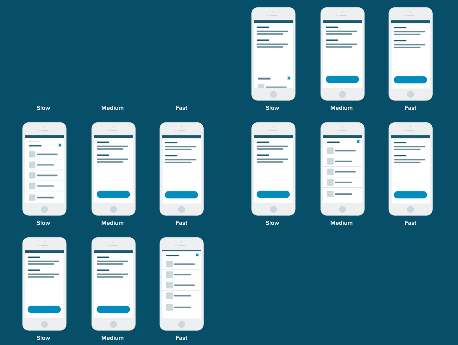
Motion is the reason for that smooth and slick app feel. The ease of creating motion in a native app setting has made them a staple of the medium. Now is the time to bring that ease into the world of the web. Slide, fade and hinge shouldn't be complex custom code, but instead predefined motions that are easily accessible for every project.
I Second That E-Motion
Motion tells stories. Not Pixar-style, long and complicated, stories. More simple stories, like "hey, this content is different" or "yo, this item needs to be addressed" or "dude, that input was required." These stories are simple, adding excitement and context to the person using the app.
Motion is great for psychological triggers too. They help with Surprise and Delight by adding a slick polished feeling to your app. It can help Cognitive Load or Chunking by animating in content when its needed and leaving it out when it's not.
Motion opens a world of options and they need to be a part of any modern app library.
A Web Gone Flat Is a Web Gone Muddled
ZURB has loved flat for 16 years. We've flattened everything from Foundation, to our apps to our stomachs (we wish ' we were working on it). But the flattening of the web has had its drawbacks. Minimizing most gradients, shadows and skeuomorphic elements has left a void in the design world for content differentiation. Motion helps us bring that back.
- The loss of heavy gradients have removed some of the hierarchy of a page. Motion draws the user's eye to help correct the lack of hierarchy.
- The lack of skeuomorphic elements can remove context for the user. Motion can help show the user where they are and how to get back.
- The removal of most shadows has taken away the context of 3-D space. The movement of one item on top of another item allows us to retain some of that context.
Wow, motion sure is sweet!
The Anatomy of Motion UI
When we set out prototyping for motion UI, we knew we needed something awesome. We looked to our own needs, seeing how we could create a motion library with quick and flexible animation for prototyping. Then, precise and lean animation for a production environment. We're using Sass mixins, CSS animations and transitions to make some really neat effects.
Animations
These use CSS keyframe animations to display content with subtle movement and effects. They're great for eye-catching CTAs, loading spinners, and error states.

Transitions
These use CSS transitions to show the tweened state of an object shifting from one position to another. They're great for replacing content, showing new content and UI components like off-canvas or dropdowns.

These are both useful in their own places and both work together to make a super killer experience for your web app user.
Motion Modifiers
Just like buttons, panels and tons of other Foundation features we'll be using classes to help rapidly build a wide array of options. You can start with base animations like slide, hinge, scale, spin and fade. Then use motion modifier classes to affect the direction, speed, iteration, ease and delay. Now you can rapidly create a huge array of motion. No need to fuss with a Sass or JS file ' until you want to.

Production-Ready Animations
We're not selfishly keeping all these animations to the prototype stage, but sharing them with all the sweet production-ready sites. This includes extensive mixins to fine tune every animation above. Make the animations your own, but save the headache of having to scratch write them.
See For Yourself
We want to share our work with you, the community. Sign up below and let us know you want access to our beta Motion UI.
UPDATE: Motion UI is now an open source Sass library!
In preparation for the upcoming release of Foundation for Sites 6, we've open-sourced Motion UI, a Sass library for creating custom CSS transitions and animations. Originally bundled with Foundation for Apps, this updated version includes more robust transition options, an animation queueing system, and flexible CSS patterns that can work with any JavaScript animation library.


