We've had a great response to Foundation so far (thanks everyone!) but one piece of feedback we've received is that the small device layout for the Grid is too limiting. Currently, everything just stacks up, and sometimes you need more. Well, we heard you!
Enter the Foundation Phone Grid, released last month. We wanted to take a few minutes and show you how it works and how to use it on your projects.
How it Works
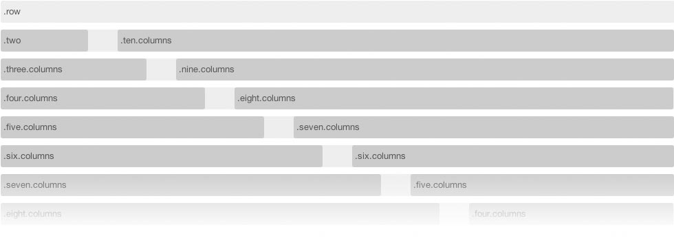
The Foundation grid is 12-column, meaning you can have any combination of columns that add up to 12. One, seven, four; five, five, two, etc. We didn't think it made sense to maintain that many columns on small devices, so we opted for a four-column grid.

You'll notice that, of course, we can't just translate the 12-column grid sizes into four by dividing them all by three or something like that. How many columns is 5/12 when you only have 4? It's close to six, but not quite there, so do we round ' up? Down?
Rather than guess, we created four special classes that can be added directly to the existing grid and give you control of how you use the phone grid. By adding classes of:
- .phone-one
- .phone-two
- .phone-three
- .phone-four
…to the existing columns you can determine how your layout adapts on a smartphone or other small mobile device. Let's look at an example.
Example Time
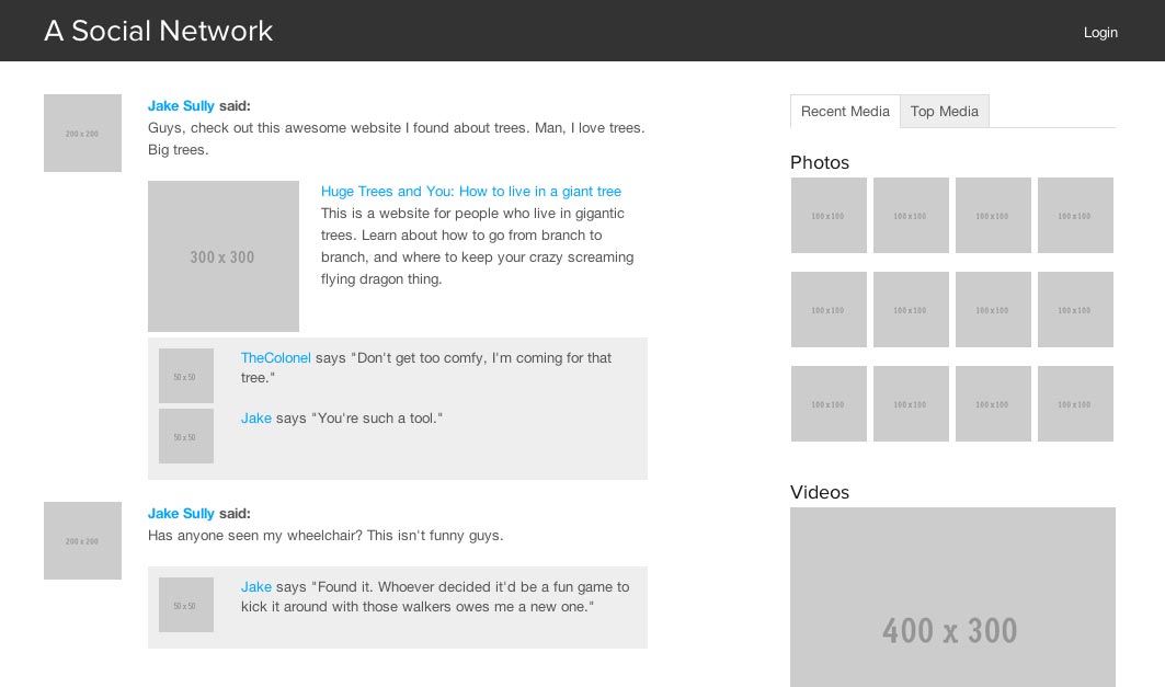
We'll use one of our existing Foundation example pages to see how this works. Consider this page:
This is a fairly simple layout for a fake social network, laid out entirely with the grid. Let's look specifically at the block on top left, an entry from a particular CGI movie character. We've used the grid to set this up, and the markup looks like this:
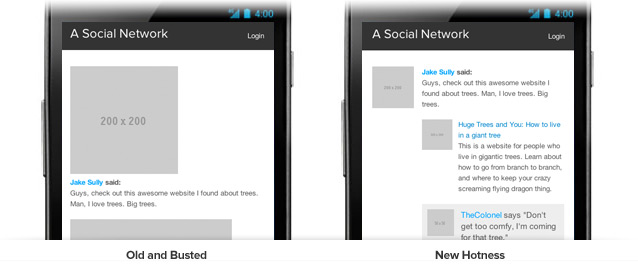
With only the default Foundation grid, every one of these column sections will get stacked on top of each other. For things like user avatar, or images with comments on them, this sucks.
By adding in classes for the phone grid and relying on Foundation's innate ability to nest rows, we can switch that up to something much more robust. Check it out:

The markup for this revised layout looks like this:
Notice how we simply added phone-one and phone-three classes right alongside the existing column sizes? Easy peasy.
Try it out!
The phone grid is part of Foundation 2.1 and can be downloaded from Github, or from the Foundation website. We'd love to hear what you're using Foundation for whether you use this feature or not. Just link it up in the comments below or email us at [email protected].
We've got a lot more fun in store for Foundation including video-embed scaling that works (really), source ordering, bug fixes, and refined styling. Stay tuned!
