After browsing Hacker News yesterday, we came across a gem of a post that highlighted Facebook's unsupported browser (or Improve Your Experience) page. After an initial look, nothing really seemed to stand out. And then we took a second look.
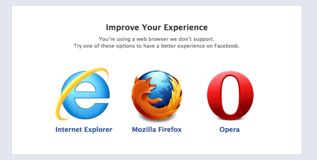
Here's the page:

There's a glaring omission here: Apple's Safari and Google Chrome are absent — completely. On first thought, this doesn't make a whole lot of sense. Clearly, a 'better experience' can certainly be had on these two browsers.
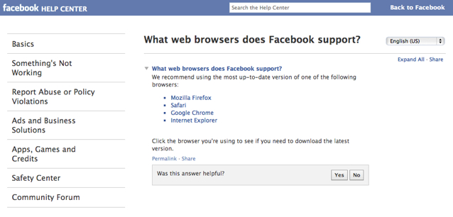
After seeing this, we dug into the Facebook Help Center to find more:

This page is VASTLY different than the one seen in the previous screen, so what gives? Facebook endorses — through the 'Try one of these' and 'We recommend using' text in each screen, respectively — so why does this differ?
On one side, it's a question of design strategy. It wouldn't make sense to list two competitors when you can list valid, non-competing options in place of them. Let's be honest — Internet Explorer, Firefox and Opera are good browsers, but many would also agree that Safari and Chrome are just as good, if not better, options for browsing Facebook.
Technically, Facebook shouldn't care what browser a person uses, as long as that user uses Facebook and uses it often. It's in Facebook's best interest to ensure every user has the best experience so they use the site more often and enjoy visiting. Whether the user realizes it or not, a good experience using Facebook should be the end goal not just for user acquisition but user engagement and retention — so why shouldn't Facebook recommend the three absolute-best browser options in pursuit of this goal?
Since Facebook is so heavily-dependent on Javascript, it figures that page load speed would be the biggest factor on using the social network. Lifehacker's test from late last year showed that Chrome blew away the three above browsers in this metric.
Another angle would be de-prioritizing the user's needs in favor of short-term business goals, which is how one of our team members approaches this situation. It traditionally hasn't worked out well. Recently, Microsoft began charging users for crapware. Why charge for removing something that should never be there in the first place? In order to meet short-term business goals, Microsoft is actually charging users to make their experience better — something that will not be well-received by Microsoft owners.
All of this considered, we return to our main question: Why would Facebook list different information on both of these sources if they recommend the full list found in the second screen? Some interesting hypotheses have been presented:
1. There are specific pre-existing business relationships.
Facebook could have strategic business relationships with the creators of these three browsers. In the event this is the case, it makes perfect sense for Facebook to highlight those who they've decided to partner with ' and bury or omit competitors. What incentive would there be to send traffic (and potential users) to them?
Which leads into our second point ...
2. Facebook may be creating a browser.
A logical possibility from this omission is the idea that Facebook may be creating a browser of their own. Interestingly enough, Pocketlint reported that Facebook was eyeing an Opera acquisition, which would certainly position the recently-IPOed social network well for this to happen.
3. The page may simply be old.
It's a possibility that the Unsupported Browsers page may simply be an old page that no one at Facebook has taken the liberty to update. Chrome was released in December 2008 and Safari's Windows version was released in mid-2007. In this event, Facebook indifference would be driving forward this interesting debate.
Is this an example where competitors are purposefully omitted at the expense of users' needs? Is there a specific business goal here that Facebook is trying to accomplish?
Let us know your thoughts in the comments.