Remember when the web was a collection of static websites, largely HTML, no CSS, and layout done with tables and frames? How about even farther back ' when your choice of mediums for design were print, film, industrial, and maybe even radio?
What about the aforementioned mediums is consistent? They were all linear. That meant we could think about things going from A-Z and stop there. Even when we got digital interfaces (enter HTML), we continued to think of interfaces as static screens for decades. It made things simple, and we put our focus into cutting the amounts of clicks on that trail to get people to the end faster. The data even seemed to prove it, with more clicks equaling 'bad' and less clicks equaling 'good.' This especially seemed to ring true in the eCommerce world where it's been accepted that the more hoops you make your user go through to buy something, the less sales you'll see. It was estimated that $4 trillion (Yes, that's trillion with a 't') was left in abandoned shopping carts in 2014, and so an entire industry of 'click reducers' have sprang up, 'optimizing' checkout flows to get people from A to Z in 1, 2, and only if necessary, 3.
That Takes How Many Clicks?

Today MV* frameworks (Model View *Whatever; Angular, React, etc.) are all the rage, and even the most basic websites have some way to serve up content or state dynamically on the fly. In the early days of the web, and still largely prevalent today, this stuff got served up from the server side. AJAX, jQuery, and the late-comers like Angular and React took that concept and ran with it ' allowing us to render all that state on the client side, unleashing the power of front-end developers and designers alike.
Many practitioners of design across various mediums often try to divorce themselves from technology. Technology is temporal and transitory; it evolves and never stays still. Good design should be permanent and everlasting (Or so our hubris gives us cause to think). This is actually a good thing, as we force ourselves to think about the constraints of the opportunities in front of us, not the technology that currently binds it.
Unfortunately, the reality is that designers don't really divorce themselves from technology, they just root themselves to past constraints that no longer exist. We still think about our website designs like they're print designs. We think of proximity in design as keeping like-things grouped together nicely on the printed page. Those savvy enough to realize their designs aren't print, but a series of hypertext documents, think of clicks instead of nearness ' but they're all wrong.
How many times have you heard someone say, 'Yeah, but that'll add an extra click'. Hearing that comment 5 years ago, I would have responded, 'Gosh, you're right, we gotta rethink this interaction thing'. Today I would respond entirely differently, I'd say, 'I don't give a crap how many clicks it takes'.
Why not?
Websites used to be reeeeally slow. In pop culture we make fun of this fact, the stereotypical example is a nerd in his basement eagerly awaiting a pornographic picture to load on his screen. An hour passes, and he's thrilled to see it finally fully rendered on the screen.
Fast forward to 2016 and websites are lightning fast, that kid in his basement has more pictures than he knows what to do with. His mom is worried. And you, designer, should be too-- but not for the same reasons. You should be worried because you're still designing for static proximity, and the least amount of clicks to the desired input.
Where did we get this notion of clicks? Well, as exampled above, it used to take a long time to load a screen. Designing an interface that required a user to wait minutes before their content was available after clicking was, and still is, a big no-no. How long should we wait for a screen to load in 2016? According to Web Designer Depot, the desired time is 500 milliseconds to two seconds. Mere milliseconds more than the blink-of-an-eye.
We measure successful interactions in clicks because it was inferred that clicks take time, and add minutes to the end-user's experience. If I'm running an e-commerce store, or a marketing page, I need my user's experience to be as frictionless as possible. The logical result of this thinking is that we need to reduce the number of clicks it takes to get to checkout, or to that lead conversion form.
From a site-to-site point of view, as of 2016, the average page load is 5 seconds. But here's the deal folks, pages are a thing of the past. Conventional wisdom has it that If I've got a a checkout flow that's three pages deep, the absolute minimum amount of time it takes to get to that purchase is 15 seconds. But why do I need 3 pages of checkout flow? Why don't I have state changes instead of pages? The answer is, again, designers are still designing like it's 1999.
When we ask folks in user interviews how they think an application should work, they tell us. But it's important to remember they are telling us what-they-think, not how they actually prefer it; they tell us about their ideal interaction. Turns out, however, that the ideal state of things is not actually what they want. When processing the question they tell you what they think at that moment in absence of the actual real experience. Henry Ford is famous for saying, 'If I asked people what they wanted, they'd of told me faster horses'.
Following this logic, when people tell you they want less clicks, they are telling you they like the idea of less clicks. But really what they want is mental proximity.
Design for MENTAL proximity

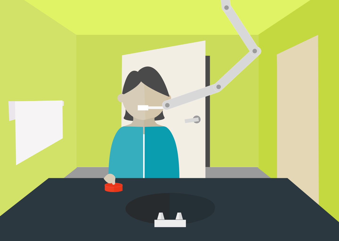
I'm fond of asking people the question, 'How many clicks does it take to brush your teeth?' The point of the question is to lay bare the fact that humans don't think in clicks-- We evolved in a clickless world. This is something Amazon demonstrably understands as evidenced by some of their current innovations, like the Dash Button.
The Amazon Dash Button seems completely ridiculous on the surface to some. It's a button that does one thing, it reorders the product printed on the label. The quintessential example of the Dash Button is the Tide dash button. You place the button on your washer and dryer, and when you run out of laundry detergent, you press the button.
Upon first hearing of this, many of us thought this was a crazy stupid idea. 'I can already do that with my phone!' some said. 'Why do I need a dedicated button for something I can do on my phone with relative ease?!'.
If one analyzes the situation, they might reckon (and rightly so) that it would literally take more time to get up (from the couch, bed, etc.) and walk to the washer/dryer to press the button than it would to pull a phone out of their pocket and order more detergent through the web interface.
But, when I realize I need laundry detergent, I'm not in bed, on the couch, or anywhere else. I'm doing my laundry. The button is closer mentally and physically at the time of need than the same button represented in my phone.
What Do Your Users Need, and When Do They Need It?

Design Proximity is no longer about just physical proximity, it's about mental proximity. It's not measured in pixels from one button to another, but from one interaction to the next. It's not measured in clicks, but in the perceived nearness or proximity of that event to the next one in a chain of events.
When I ask how many clicks it takes to brush your teeth, it's easy to understand where physical proximity comes into play. I have my toothbrush, next to my toothpaste, next to the sink. I can successfully brush my teeth without having to run around looking for all-the-things.
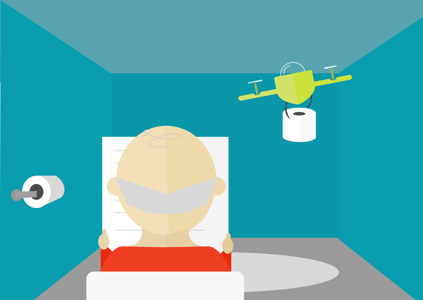
But humans aren't solely teeth-brushing machines, we have other needs too. When I'm done brushing my teeth, there is a next event that almost always needs to happen: I need to pee. Thankfully, through who-knows-how-many-years, humankind has evolved a set of precedents that account for this mental proximity. My toothbrush and other aforementioned accoutrements all live in my bathroom, and my toilet is right there. We've got physical and mental proximity living together side by side.
So, whether you're a designer, developer, or designer/developer, we encourage you to think outside of static layouts and think about all that state you have to play with on the screen. Stop thinking about your sites and apps like they're real estate; trying to shove as much content into as small a space as possible. Remember there is no physical limit to your canvas, it's limited only by your powers of imagination. Unshackle yourself from the constraints of yesterday's technologies and open yourself up to the possibilities of today. Physical distance between elements is but one constraint, relying solely on these dimensions is like ignoring color and pretending the world is black and white; 2D instead of 3D. And don't forget what your user wants to do next.