We've said it once and we'll say it again, the old ways of web design don't apply anymore in the age of so many different phones, tablets, and other web-enabled devices. Millions of people use those devices on a daily basis to hop online. Websites can no longer afford to be stuck in 960px Photoshop templates.
Some websites have embraced the brave new world of countless devices, such as The Boston Globe. Yet the number of websites that are responsive are few and far between. The latest to join the responsive ranks is Smashing Magazine.
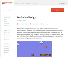
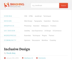
Given our interest in responsive web design and our development of Foundation, we were intrigued by Smashing Magazine's new homepage design. We liked what we saw and decided to do a complete deconstruction of the site, looking at what the folks at Smashing Magazine did well and at things they could improve on.
You can see our complete deconstruction from several different views (laptop, tablet, and smaller devices) by clicking on the thumbnails below:
-
Laptop

Laptop View Deconstruction Smaller Laptop, Tablet

Small Laptop View DeconstructionTablet Portrait

Tablet Portrait DeconstructionAnother Tablet Portrait

Another Tablet Portrait DeconstructionSmall Device

Small Device Deconstruction
It's awesome to see other sites take the plunge, think about how their site will display on all the future devices that will come out and become responsive. With Smashing Magazine, there are certainly opportunities for improvement, but it's a step in the right direction. We excited to see how they iterate and refine their site in the coming months.