Storytelling and products go hand-in-hand. Crafting a good story requires establishing a tone and mood. What's the feel and messaging you are trying to tell throughout your product? Is it a cohesive tale, being told through visuals and content? These are crucial considerations when crafting a creative direction.
Creative direction isn't a layer we add as an afterthought. Organizations and designers, however, tend to consider creative direction as a singular, herculean task. But it doesn't have to be. Creative direction can be two phases: creative and direction. The former is about figuring out the storyline of your product, the other is long-term execution. It's important to differentiate which of these two phases you're in and how much time should be spent in one or the other.
Creative is Storytelling
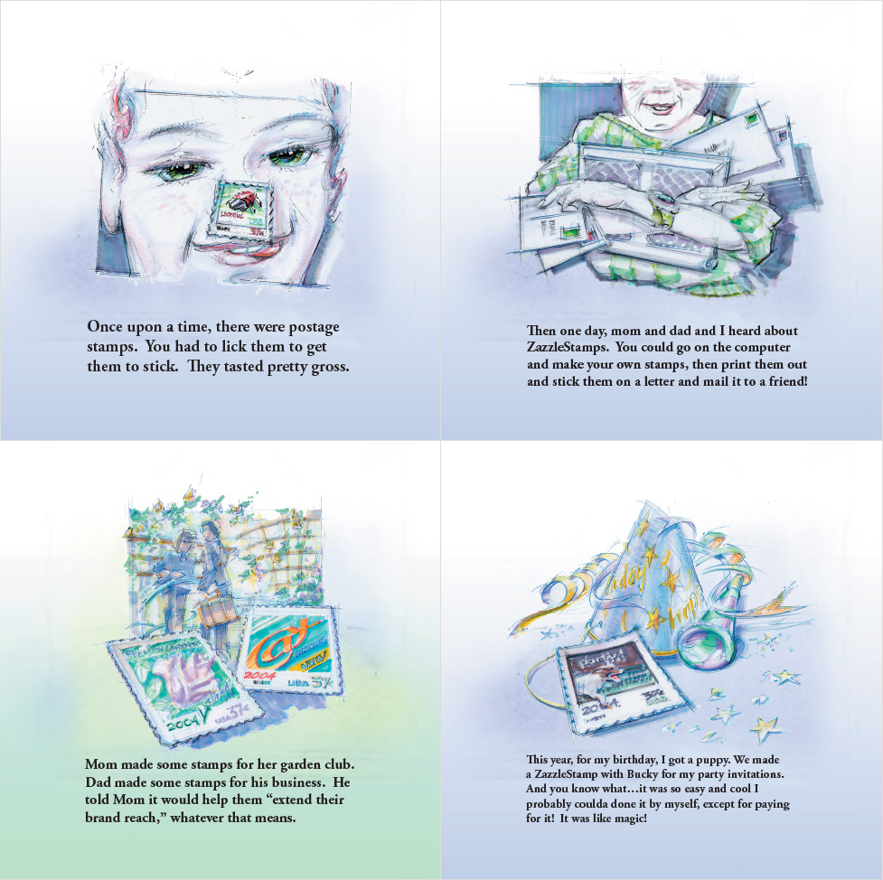
Back in the late '90s, when ZURB was a one-man show out of our Chief Instigator's apartment, companies were throwing brochures on the internet. They were little more than extended interactive magazine ads. Those companies weren't thinking of their sites as products — and brochures were great for storytelling, but made for lousy products. The first time storytelling and product came together for us was with our work at Zazzle. We used storytelling to express what the product was all about. We even crafted a literal storybook that allowed us to map out the concept and convey it in interesting ways.

Pages from Zazzle presentation to USPS
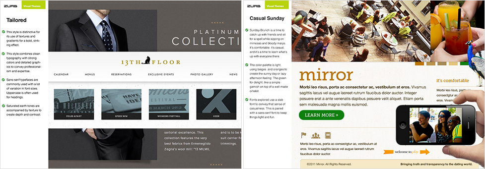
The creative phase of creative direction is where you explore the story of your product. You're exploring many options, ideating on many possibilities. What you're doing is figuring out mood, the tone and the voice. In this phase, you'll create mood boards that determine how your product's branding will look and feel. Details are in flux during this phase. Give feedback on how creative elements tie together to tell the story, not just elements in isolation. Do they fit together? Or are they inconsistent?

Two moodboard concepts
Square is a prime example of this. The story they tell is that Square is trustworthy and easy to use. They achieve this with their creative direction. For example, they use a simple sans-serif. The color palette consists of blues and grays, which equates to trust. Finally, rounded-corner buttons say 'easy to use.'
With creative direction, we can't make a single decision and know exactly how everyone will react to it. It's subjective. That's why we make several small decisions, such as typography and color choices, to subtly reinforce our story.
Direction is Committing to Your Story
Once you've made all those small decisions, you'll start to narrow in on a direction. And once you settle into that phase, you don't want to keep exploring possibilities. You want to commit. This is a long-term play. Change in creative says you're changing your story, and that could backfire. You'll create uncertainty. Customers will lose trust because you're wildly changing things. Direction and consistency builds trust with customers.
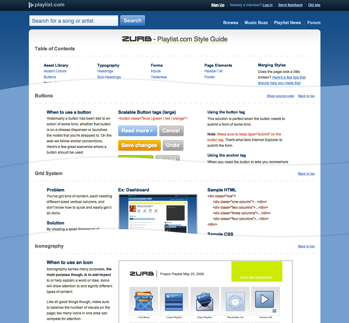
A style guide is a worthwhile investment to ensure you stick with your creative direction. We create style guides for everyone of our Studio customers. We set them up with the tools to maintain consistency in their work. If they were to do another iteration or add new screens, they'll be able to do so without losing the brand. We started doing style guides since around 2008. In fact, Foundation, our front-end responsive framework, grew out of our style guide boilerplate. One of our first was with Project Playlist.

Snippets from the original and very extensive style guide
Of course, it may take a few starts to find your voice. Jamba Juice changed their graphic and messaging style a few times before settling on a handwritten font and illustration style. But it's important to capture what that branding is once you committed to it, which is where a style guide comes in handy. It commits you to your creative direction.
A style guide should contain coded UI patterns such as buttons, that will be used throughout your product. But it's also guidelines on how and where to use them and in what context. You'll want to include enough information that someone could build out a site or more. Your style guide should contain the some of the following:
- Grid
- Code structure
- Colors
- Typography
- Buttons
- Forms
- Patterns
But one last caveat. Be aware of what phase of the process you are in — creative or direction. If you spend too much time trying to figure out what your creative is, then you'll never have a solid direction that will shape the story or persuade the audience.
Persuade Your Audience With Creative Direction
We've helped more than 250 startups and companies shape their creative vision. If you want to learn more about creative direction, we've created an online class to help you out. You'll learn how to establish your story and how to execute on it:
- Setting the path to creative visions: from using narrative to exploring the creative direction early on through sketches, moodboards and treatments.
- Nailing the creative direction through details and time: from seeing your vision through details, documenting patterns for future iterations and creative direction over the long term.
