Ahh, HTML emails. One of the most dreaded parts of product design. For the uninitiated, designing and developing HTML emails is notoriously difficult. It results in a sea of tr's th's td's in your HTML code. Your styles also need to be inlined so some email clients can even render the styles in your email. Finally, much like a wild beast, Outlook will do whatever it wants sometimes ... Seriously.
In 2013, we released our responsive email framework - Foundation for Emails (originally known as Ink). Ink was an awesome contribution into the world of responsive email design. It was the first of its kind! Designers could now code up an email that would look great in everything - even Outlook. We began to tame the beast that is HTML email, but we could further domesticate it.
We set our course to conquer the beast that is HTML email with the upcoming Foundation for Emails 2. Our main goals were to:
- Include a small grid - just like in Foundation for Sites
- Create handy templating language - letting you use simple tags to spit out the numerous table tags
- Flat file generator (Panini) - Lets us use partials and handlebars to get your email off the ground.
And...We did it! But the journey wasn't easy, and we still have our work cut out for us. However, for our sanity, and to maintain yours, we've documented some of our best battles while building Foundation for Emails 2. Here were some of our favorites:

The Missing Link to Patching the Leaks.
It all started trying to solve, what was thought as, a simple problem. We wanted to create a menu element. Simple enough - just some basic inline-block elements and anchor tags for the links. We coded it up and things were lookin great. Here's what the syntax looked like:
Easy peasy! We fired up Litmus to test it out. Things were lookin hot - even in Outlook 2000. But wait! Something was completely off for Outlook.com and Office 365. Like waaaay off.
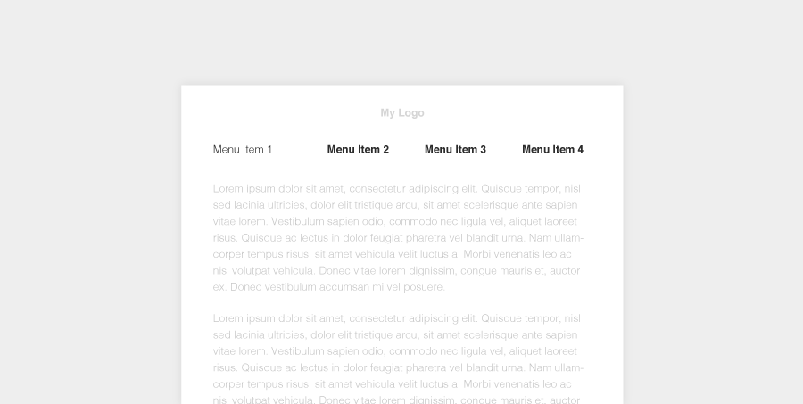
Ok. Maybe the css rules weren't specific enough? Maybe I just need to !important something? No dice.
Alright, this is a little weird. Maybe it's because we used a td, not a th. Nope.
Hmm. Ok now this is confusing. It works in literally everything but the Outlook.com and Office 365. What the heck? Let's just start applying different color properties to the tag to see if anything is applied. Let's make the font color blue for table.menu, purple for the td, and pink for the a tag. Everything should be pink right?

What?! How is this even possible?? Ok, let's wrap each menu-item with a table and give it it's own class Hold on ...
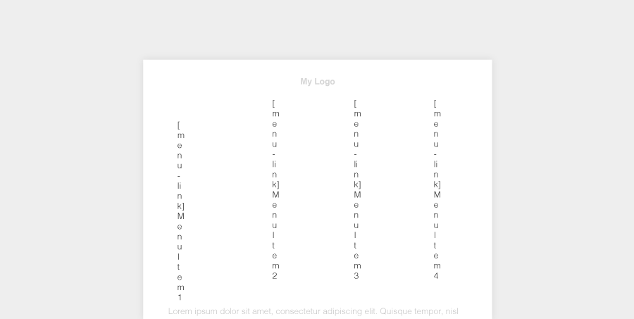
It's injecting HTML now?! Looks like I accidently added menu-link class in the href attribute. Wait a second, let's just see if it needs an actual href ...
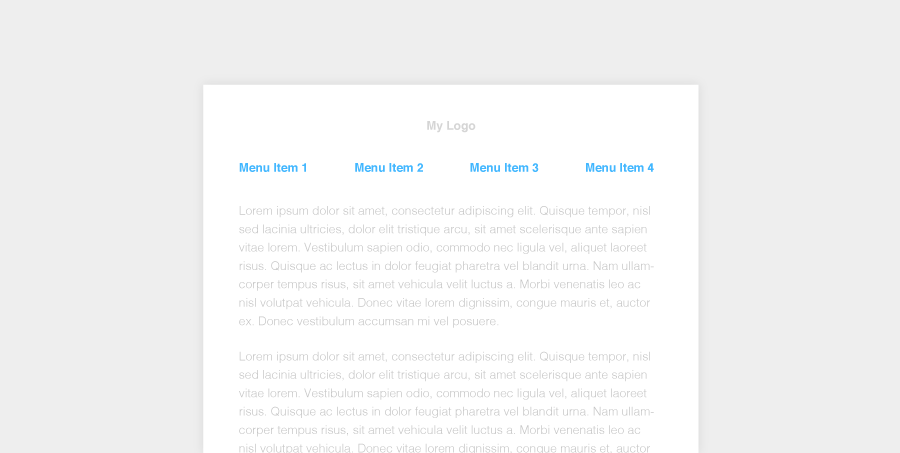
Yes! Holy. Smokes. Outlook.com and Office 365 need your anchor tags to actually have a proper link to render. 15 iterations later, and we've finally narrowed down this painfully simple bug. Emails are hard sometimes.

Reeling in the inline with Inky and the ZURB Stack.
HTML emails can also be smooth sailing sometimes. We were flirting with the idea of inlining our own CSS. It was actually pretty simple! In the past there were several steps just to prep an email ready to test. First, we had to insert ink.css and our custom styles into our HTML file. Then we copied and pasted that email to our handy inliner. Finally we had an email to begin testing.
This would take the wind right out of our sails.
We harnessed the power of Gulp and a CSS inliner. We just inlined everything but the media queries and kept those in the style tag. It just kind of worked! Not too shabby.
Ok, not too bad. But we took it a step farther. We heard some issues on our github around some file size limitations with ESPs. As we started building with components like the block-grid, we realized that white space can still mess up designs - particularly in Firefox web clients. We decided to collapse the whitespace for production.
We realized there were two states of an email developer ... either building or debugging. We created two tasks for this! We have `npm test` that does cool things like fire up BrowserSync to instantly update your changes with every save. Then, we have `npm run production` which inlines and minifies everything, getting your email prepped for the debugging and production world.
This seems to work awesome in everything, except one minor bug in outlook.com in Firefox

Inky to the rescue - introducing the new and improved grid!
Ink was a good first pass, but we weren't able to tackle the small grid for some devices, specifically, android 4.4 default mail client. Luckily, we had the help of a killer community on Github. We did a little research and discovered that we could simply change TD tags to use TH's. And it just magically works!
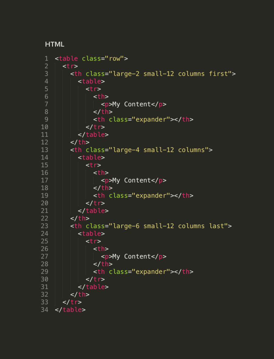
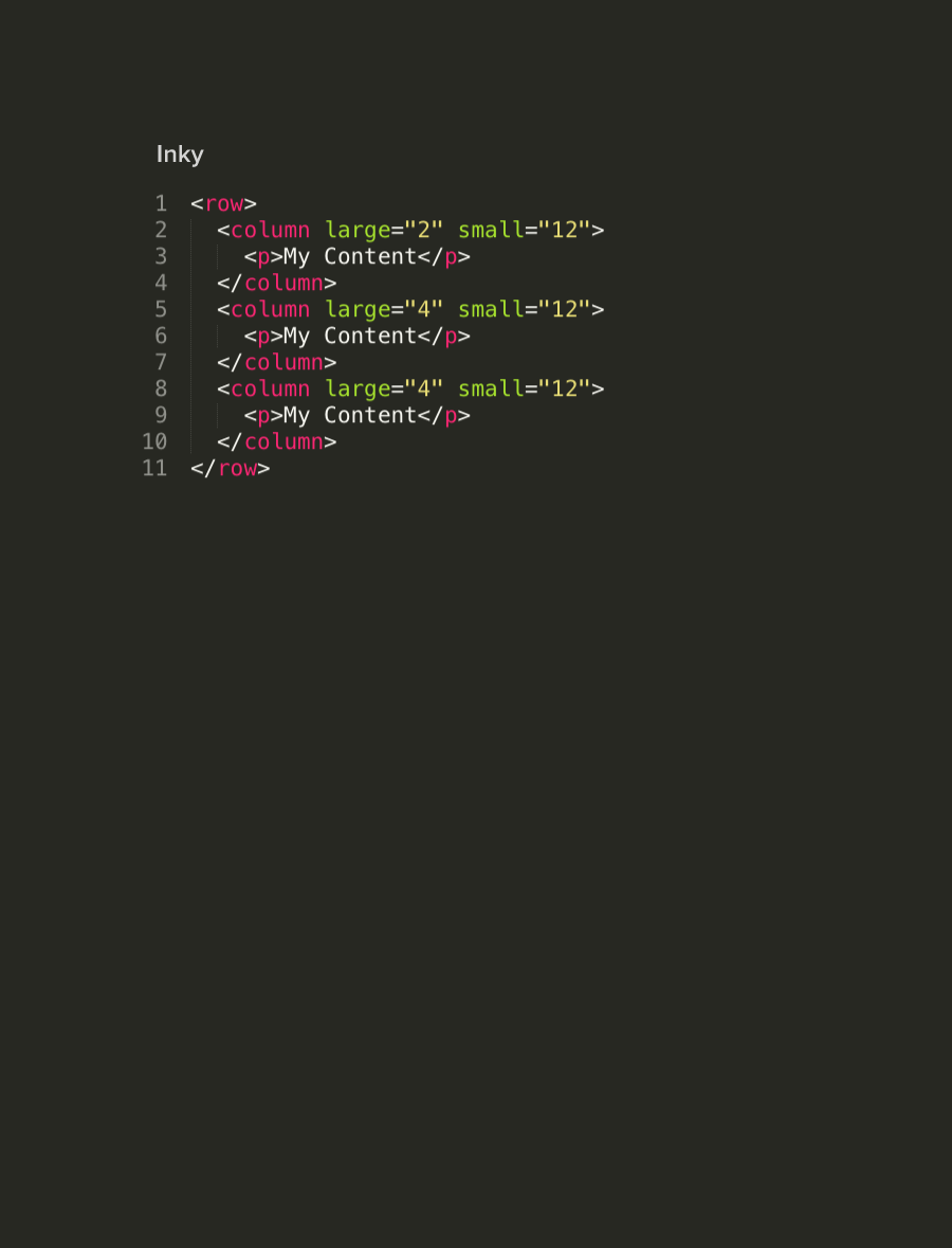
We also took a stab at creating an easier to understand format for the grid. Mainly removing those pesky wrapper classes. We've updated the syntax to look like this:
We've now got this crazy awesome templating language that magically converts custom tags like <row> and <column> and spits out the numerous tags needed for an HTML email. Checkout the code difference below!
The Calm After the Storm

All in all, we've had quite a journey! We've had some serious horror stories battling the beast that can be email, but our struggles have resulted in a rock solid responsive email framework that will save you time coding and testing your emails. Foundation for Emails 2 is coming out soon, so be sure to sign up below to get the latest updates. In the meantime, we'd love to hear some of your email battles. Feel free to share them in the comments!


