The web is serious business in our eyes. It's our bread and butter. We're always looking for ways to improve how we build websites. Thinking of designs across different-sized screens has become the norm. We can't design a site these days without considering the smaller presentation. In fact, something like 70% of people viewing and interacting with the web do it from a mobile device.
We live in a world where we can't get away from the plethora of screens inundating our society so it's always refreshing to see another website adopt the responsive web and release. We follow ReadWrite almost daily and got pretty excited when we heard they'd released a new design that works for any screen size. We couldn't resist digging in and seeing what it offered and where it could improve. We already did so once, but we decided to delve a bit deeper than before.
Feedback is an important method of ours and we have a lot of respect for ReadWrite, which is why we want to share our thoughts on the new responsive design based on our experiences with many responsive design projects.
The Audit
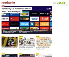
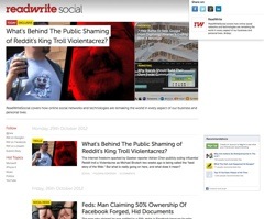
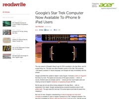
We decided to audit 3 different pages in large format and small format. Those pages were: the homepage, a category page and an article page. These pages show off the main areas that people will visit on the site in order to consume content. Overall we found the redesign works really well. It's refreshing to see a content site focus so much on the content and not extra bits. There is still room for improvement, but great work overall. Without further ado, check out the audit by clicking each of the thumbnails below:
-
Homepage, Desktop

Homepage, Desktop Category, Desktop

Category, DesktopArticle Page, Desktop

Article Page, DesktopHomepage, Mobile

Homepage, MobileCategory, Mobile

Category, MobileArticle Page, Mobile

Article Page, Mobile
The Takeaways
Our audit lead us to break down the design with three main takeaways that we'd like to get across to our readers, those are:
- The content is easy to discover and digest. It seems as though ReadWrite took a mobile-first approach to this new design. Paring the site down to the minimum needed is perfect for helping user read the content no matter which device they pull it up on.
- Ads and secondary navigation get in the way. This only happens on the larger layout, but the ads are very distracting and fight for attention with the content. Giving some extra space to the left of the ads and the right of the secondary navigation on article pages will help the content breath, making it easier to read.
- Find creative ways to offer more content that doesn't get in the way. There are very few areas on this site other than the top navigation that let you find more content. The places it does exist are either a bit hidden (at the bottom of a really long page) or in the way (fighting as side navigation next to important content).
You can see the entire set here as well. As we said before, we're overall pleased with this redesign. It's a pretty good site and we're happy that they've gone responsive.