Amazon's cloud service, AWS, is usually spot on. It's got a great status dashboard, showing history and uptime. We use it all the time and depend on its S3 service for our products. Sure, there have been some shaky launches in the past (looking at you , EC2). Overall, however, we haven't had many problems — except until recently. It was a good example of how transparency, or the lack of transparency rather, can damage customer trust.
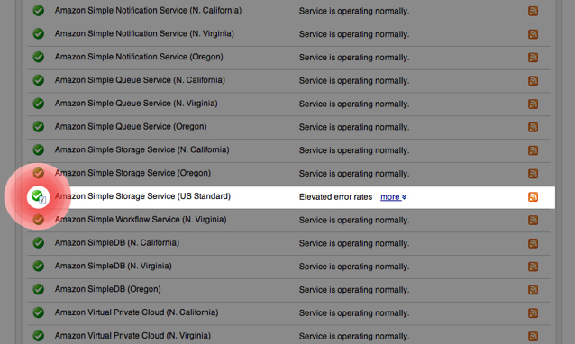
S3 went down last week. So we checked the status dashboard to see what was up. Everything was reported as being "operating normally" — all lights showed green. Upon closer inspection, however, there was a curious little icon that when clicked, explained the service was actually having problems. Take a look at this screenshot (we've made it easier to see the icon):

And here's Amazon's explanation for the icon:
Informational? So we clicked on the icon and found out something was amiss:

Then another message popped up underneath that one a little later:

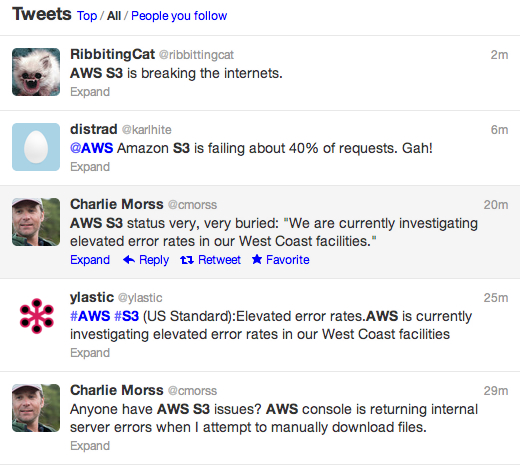
Yep, it was broken. We kinda scratched our heads a bit, wondering just what the heck was actually going on. A check on Twitter confirmed it. The service was, in fact, down.

This had us asking ourselves, "Does no one at AWS look at the status dashboard and see this contradiction?" AWS was telling the truth while they were lying at the same time.
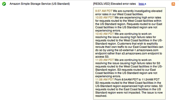
To Amazon's credit, timely updates were posted to the dashboard while the service was down for almost two hours. Very responsible of Amazon, but not quite perfect. For instance, a work around was provided an hour into the outage — buried under the footnote. Take a look:

Why wasn't this at the top of the page? Why weren't updates communicated on Twitter? This makes it hard for customers to know what the heck is going on. When others depend on your service, they need quick information during any disruption. They shouldn't have to go on a hunt for this kind of crucial update. It should be transparent, obvious and at the top of the page so everyone can easily see it.
By sliding updates into a footnote, it makes it seem that you are being blatantly duplicitous, hiding the fact that something is wrong. Other services don't slide their updates into a footnote or obfuscate the fact that they're having a problem.
Take Github. When they're down, this page is blood red. Updates are always right on the top of the page. Or Basecamp, which was down for less than a minute yesterday, and the entire day is represented by a red dot. These examples not only show transparency but incredibly high standards for their uptime.
We try as much as possible to be as transparent when something is broken, tweeting it out through our various Twitter handles and talking to customers directly through email.
Transparency is crucial to building trust with your customers. Hiding information behind icons and footnotes isn't helpful in building that trust. It destroys it. If something's wrong, if something's gone down, be honest and upfront. Blatant lies only get in the way of building customer trust.