UPDATE: Bit.ly changed the call-to-action text in the upper-right hand side of their design, so we hopped back in to see if it had a positive impact on people adding bitmarks.

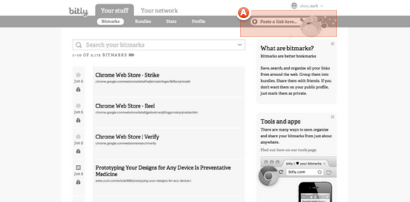
This time, we used a Verify Yes/No test to determine the percentage success that a user would click on the correct spot to add a bitmark, highlighted in orange. Amazingly, only 61% of people successfully clicked within the correct area, and the median user took 24.61 seconds to make a selection.
Bit.ly released some shortening changes this morning and we'll be monitoring closely for new design changes in the coming days. In the meantime, enjoy our original analysis of the Bit.ly redesign below.
There's been quite the hype around the new bit.ly redesign — for all the wrong reasons. Users are not amused by the changes. Many users who view the bit.ly service as a cornerstone for their social analytics are openly boycotting the service in blog comments and on social networks.
Bit.ly made a simplistic interface very difficult to work with in an effort to pivot into social bookmarking.
Curious to know more about how users are actually interpreting the new design, we set up a series of three Verify tests, which we used to learn more about the new design. We shared these tests with our Twitter followers on our main handle (@ZURB) and received an amazing response. As much as we'd like to endorse bit.ly's new design, we're not surprised that the new design has caused several issues for users just trying to get simple tasks done.
Test 1: Do people know where to go to add a new Bit.ly link (bitmark)?

If you're going to bit.ly, you're probably most interested in creating a shortened URL. So does the new design make it easy for a user to add a new bitmark?
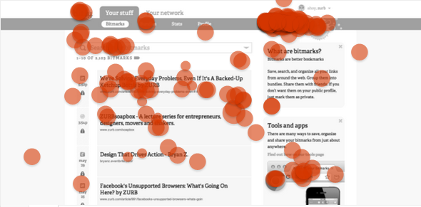
This test was by far our most popular one: We received 246 user responses. Approximately 68% of users clicked on one of the two correct locations to add a bitmark (including the bitmark search bar).
Visually, it's clear most people are confused by the previously (simple) act of adding a bitmark. There's high click volume in the upper-right hand side of the design ' the primary way to add a new bitmark.
Some people opted for the search bar (where the previous primary entry point was). However, it's clear the feed as well as the ad at the bottom right-hand side threw some users astray.
It took the median user 26.139 seconds to click on the screenshot.
Test 2: Do people know where to paste a link to add a new bitmark?

It's clear people were confused by the formerly-straightforward action of creating a bitmark. But what if we phrased the question slightly differently and opened the 'Add a bitmark' entry field?
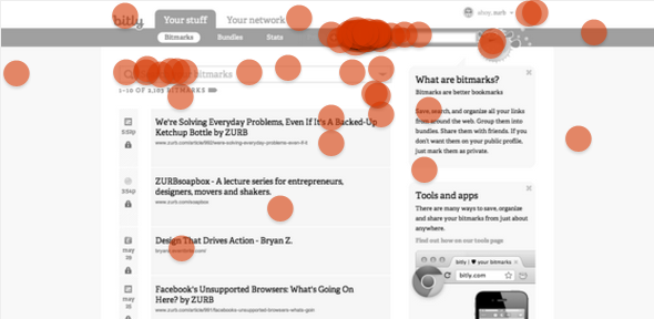
We had 83 responses to this second test, which observed if a user understood where to paste a link. In the new design, you can add a new bitmark in one of two places: The top right hand bar or the bar above the link feed.
The median user took 21.893 seconds to click.
19/83 responses (23%) missed one of the two correct answers. Therefore, it's safe to say that most users will at minimum, be on the right track, to adding a bitmark successfully.
Test 3: Do people know where to go to copy a bitmark?

One of the other odd parts about the new bit.ly design is that it's unnecessarily difficult to copy a link for sharing purposes.
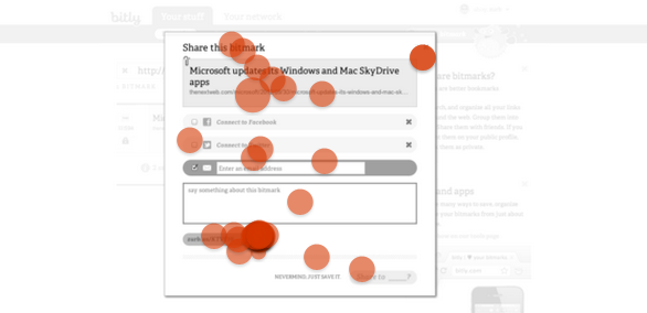
It took the median user 18.88 seconds to click on the screenshot.
We received 60 responses on this test, and the results were somewhat surprising. 16/60 responses (27%) missed the 'Copy' button altogether.
Since we captured the screenshot of this page, bit.ly adjusted the positioning of the Copy button so it is front-and-center under the link in the top box. Ironically, however, this may not be the new design's biggest problem.
Our Conclusion
In conclusion, the new bit.ly redesign was not executed well on many levels. The primary value from the service is driven from link shortening and subsequent sharing analytics, and it's clear from these Verify tests that users are more confused than ever in successfully shortening and sharing a bitmark.
While each individual test does not holistically represent the full flow for how a user would add a bitmark, it's telling that there are so many stray clicks and high median decision making times to accomplish what used to be a simple task. We're concerned that the effects of this redesign could have a devastating long-term impact for what many consider to be the current standard in link shortening services.
What do you think about the new bit.ly design?