In part 1 of this post we talked about why we needed to redesign the Notable visual annotations, and how we went about framing the problem. Now we'll show how we actually implemented the design, including some cool CSS techniques we picked up along the way.
Creating an Overlay with Layers
 The overlays comprise two objects: an overlay with the shine and a border with the transparency.
Our solution was not technically too complex. With Notable (as well as most of our projects) we've embraced the concept of graceful degradation: we take advantage of new CSS techniques that degrade cleanly to older browsers.
Our note overlays are composed of two main elements, an outer border div and an inner overlay div.
The overlay was the easy part. As Notable doesn't currently support IE6 (though it does support 7 and 8) we were able to use a PNG overlay to create the glass shine effect. It stays pinned to the top-left of the div so we don't have to worry about it scaling out to something enormous.
The border div has as its background a 1x1px white PNG, which creates the overlay itself. Combined with the shine overlay we had our glass effect. The border div also has a border-radius applied to it to round the edges in any newer browser. We gave the active state a -box-shadow property so that notes being created or edited would jump off the page.
Fun with border-image
The trickiest piece, and most fun, was actually the gradient on the border. As you can see in the mockups or below in the live code, the notes have a 4px border that fades from bright orange to a darker shade as you go from top to bottom. We didn't want to use a canvas knockout so instead we used border-image, which is a really versatile but slightly tricky CSS property.
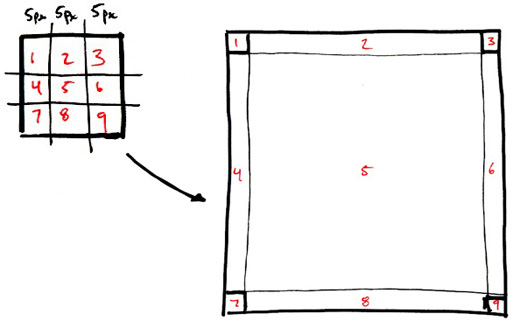
The basic gist of border-image is that you can set an image of your choosing as the overlay for the border of an object, but the truth is quite a bit more complicated.
What happens is that the web browser takes your image and divides it into 9 equal section, a 3x3 grid. It then takes the top left section and makes that the top left border corner, then takes the top middle and stretches it across the top border, and so on around the object. What's tricky is it does the same for the center of your image, stretching it across the entire object.

As you can imagine even just like that border-image has some really cool applications for making a complex object out of a fairly simple image file. However we needed to cut out the middle, or it would obscure our glassy overlay. So, we cut it out.
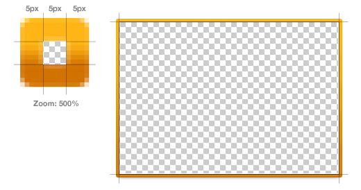
Our border image is created with a 15x15 image with:
- The middle 5x5 square removed (or completely transparent)
- The top 5 and and bottom 5 pixels as solid colors (they are such a small part of the overlay they don't need to be a gradient)
- The left center and right center 5x5px sections contain the actual gradient we stretch across the left and right hand borders.

div.border {border: 5px solid #feb515;-moz-border-radius: 3px;-webkit-border-radius: 3px;-moz-border-image: url(border-image.png) 5 5 5 5 stretch;-webkit-border-image: url(border-image.png) 5 5 5 5 stretch;}
The border-image property only has a few values: image source, width (on all sides) and the method of applying the image.
Awesome, huh? These little lessons in implementation are pretty exciting for us; it's always fun to learn new tools to make awesome stuff happen. You can see our new note style by checking out this public Notable post.
More Behind the Scenes
These short sprints happen all the time at ZURB, not only for Notable but for clients as well. Our process has worked out well for us so far, and we hope you enjoyed this little window into it. We'll keep our eyes peeled for another opportunity to share our process and how we get things done.
