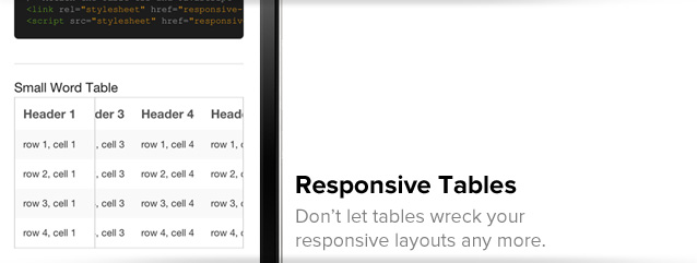
We looked at the current state of responsive tables, and we weren't happy. Today we've released a new playground piece, with a new, awesome take on responsive tables.
If you've ever tried to make large data tables work in a responsive design, you know what a pain they can be. Tables have a magical property that says they can never be so small that parts of a word have to be cut off — they can't overflow. That means that, when your design shrinks down for the width of, say a smartphone, large data tables will ensure your design doesn't actually shrink all the way down. It sucks.
We wanted to try and do better, so we got to work on a responsive table implementation that would meet three criteria:
- Doesn't break responsive layouts
- Doesn't unnecessarily hide table data
- Still allows you to compare rows with a key column
A bit of a tall order but with some crafty CSS/JS, we cooked up something we think is pretty nifty. You can go ahead and check out our new responsive tables, or stick around to hear more about how it works.
How it Works
As we looked at tables we realized that, most of the time, the first column is the unique key for a table. That provides the reference for the other columns, while the column headers provide the legend for what everything means. With that in mind, we wanted our responsive tables to have that first column available at all times.

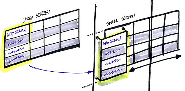
This is a schematic of how the table changes from a larger screen to a small one. Basically, we take the first column and pull it out of the table element, positioning it over the table in its own element. Then we allow the table itself, minus that first column, to scroll under it horizontally.
What this allows is for the user to see the entire table (albeit not all at once, they have to scroll) while still seeing that first 'key' column. We don't have to flip the table axes, or hide data, or break the layout, we just rely on the user's ability to swipe across to see all the data and compare the rows and columns.
There are a couple caveats here. First, for the small device format we have to restrict cells to a single line (for a consistent height). The separate left-hand column and other column elements don't impact each other, so they can't correctly dictate an arbitrary height. Second, this doesn't work in Android 2.3 and below as it doesn't support scrollable DIVs. Android 3+ should be good to go.
Built for Foundation
We developed these to drop right into Foundation, our responsive, open source front-end framework. They're great if you're working on a responsive prototype, or responsive production code, and need a way to manage large sets of tabular data. While they're built for Foundation, they should work in any responsive front-end.
Try it out, give us feedback
You can check out our responsive tables or you can go right to the code on Github.
If you're interested in other approaches, Chris Coyier did a great round-up a while back on responsive data tables — there are some fascinating approaches in there, but none which met our criteria.
If you have some other ideas to either improve on this approach, or something else we should check out, sound off in the comments. Have fun with this new code, it was fun to work on and hopefully fun for you to use!