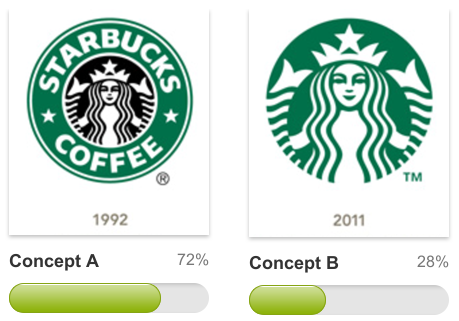
In case you were in solitary confinement with ear plugs during last couple of days and haven't heard the news - Starbucks unveiled a new logo which drops the words "Starbucks Coffee"' from it's iconic image. According to Howard Schultz, the reason for the change is part of the larger move to focus the company on selling different Starbucks-brand products in supermarkets and other channels beyond retail stores. If this is true it's understandable why the word "coffee" was taken out but it's unclear why was the word "Starbucks" taken away from the logo? Furthermore what was the reason to take away black from the logo?
The inter webs have been brewing with public dissent. Some folks even wondered whether this is just another publicity stunt similar to Gap cooking up the whole logo fracas. Twitter and Facebook have been boiling with angry and debating comments every few seconds.
So we had to know...
Do people like the new logo or not? What percentage of people does not like it? If people don't like the logo - why not? To answer these questions we decided to run a quick Verify test and ask the public which logo they preferred and why. The results of the test are below.
Here are our findings based on the results above:- majority of people (72%) prefer the old logo
- statistically people are more comfortable with the old logo
- people that like the new logo are more impulsive and make decision in less than 10 seconds
- people that love the new logo do not spend much time comparing it to the old logo
- reasons people like the old logo: it's iconic, recognizable, and conveys more meaning
- reasons people like the new logo: simplicity, clarity and design elements
Here are some reasons from people as to why they prefer one of the logos:
The old logo gives the impression of a seal, which speaks of quality and a signing of whatever it adorns.
The new logo is simple and it intrigues me to want to understand why this great icon is representative of the brand.
What do you think of the results? What's your take?


