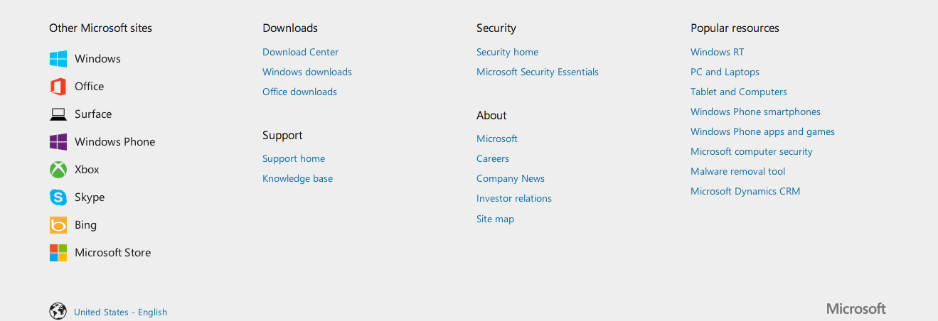
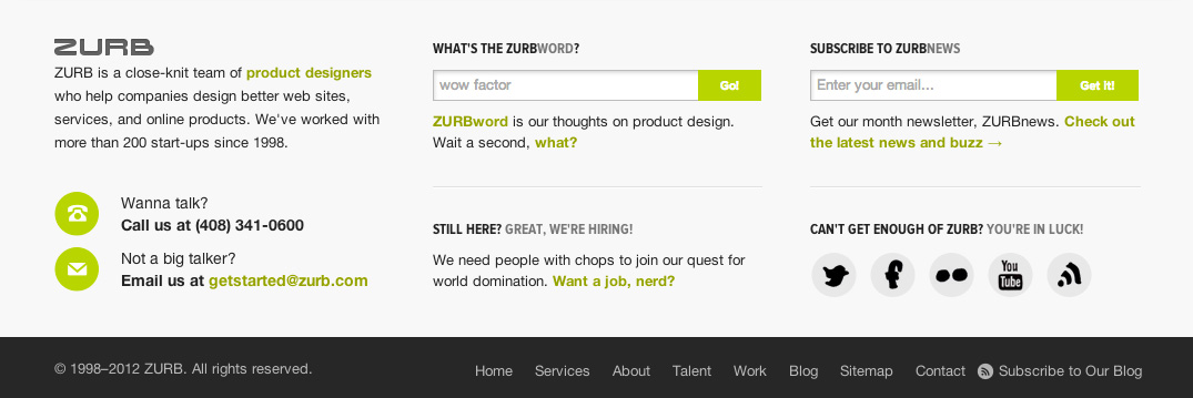
We recently wrote about what your footer says about your business. You could say footers have been on our minds a lot. We've even asked ourselves, "What makes a good footer, great?" Here's what we've come up with: a good footer must provide valuable information that allows people to navigate the site, engage and re-engage visitors with quality content, and give them a means to seek help.
It's easy to design footers as an afterthought. Designers assume that visitors just blow past it anyway — and why shouldn't they? People spend 20% of their attention below the fold. Yet those that scan to the bottom will eventually hit the footer and it'd be a disservice not to use it to your advantage.
A footer is where you can connect even more with your viewers. It's an opportunity, where you can direct them to other parts of your site or where they can contact you directly. So next time you're designing a site, ask yourself:
- Does my footer provide high-value links that will help people easily navigate my site?
- Does my footer engage visitors with quality content, and have hooks to your social media content channels to re-engage them later?
- Does my footer build trust with my site's visitors by provide a clear path to get help and contact us?
1. Provide the Most Valuable Links as a Means to Navigate Your Site
Remember it's not quantity, it's quality that search engines and your users care about. On the whole, footer links typically have the lowest click-through rate. However, that doesn't mean we can ignore them. Keywords in the links still matter, just like elsewhere on the site. Constantly evaluate the click-through rate of each link in the footer. If there are any unnecessary or unused links, remove them from your footer. Always think about what your users want, not what search engines want. That mental model will help you narrow down links that provide a lot of navigational value to your users.
Strong hierarchy - Group high value links into categories
While we are on the topic of providing navigational value, grouping valuable links into easily identifiable categories will help users make sense of all the links in your footer. Your goal should be make the footer as usable and understandable as your header.
 Read annotations on what's working well in this footer
Quality presentation - Use plenty of white space and good typography
Once you've organized your links, think about how to make them legible given the relatively small size of footer links. Making people squint to read what's in your footer is a surefire way to make people not use the footer for its intended navigational purpose. Using good typography and varying the size, weight and letter spacing improves the legibility of links in the footer.
 In this example, the designer creates a strong visual rhythm by using italicized headings and contrasting light copy against a dark background.
People also need to be able to perceive the distinction between different groupings of links in your footer. Using plenty of white space helps spatially separate different pieces of content. It helps people easily identify boundaries.

Our new footer, which were about to release another iteration of, does a great job of spatially separating different pieces of content so users can easily comprehend who we are, what we do and how to reach out to us.
Before:

After:

2. Provide Valuable Content that Gives a Reason for People to Return
Be social - engage users in your social ecosystem
It's very advantageous for designers to find ways to engage users with your social networks. Giving users one-click access to valuable information on your social feeds will provide a means to re-engage them even when they're not on your site.

Engage with quality content - give users a sneak peek before they sign up
Your site and blog is a great place to engage viewers with quality content. We highlight the four pillars of our business, such as Expo, in our footer. Expo is a site we've dedicated to exhibiting feature stories, tutorials and classes on product design. Highlighting it in our footer gives our visitors a clear path to discover interesting and engaging content to read. By creating great content, we attract interest in our services, products, Foundation and educational efforts.

3. Build Trust Through Fanatical Customer Service
The old adage, a company is its people will always stand true. Treating your customers with the same level of respect as your employees, will keep them coming back for more than just your products. Think of strong brands like Zappos, Apple, Rackspace, and Warby Parker. These companies not only have strong brands, but their customers have a cult following for everything they do.
Take Zappos. When they ran out of a particular shoe, a customer service rep went to another shoe store to get a pair for a customer. Or Warby Parker, who shot videos of themselves answering customer questions and uploaded them to YouTube.
Link to contact page or form
The footer serves a functional role, as well as a human one. Helping people navigate and find relevant content is important. Humanize your website by providing a clear path for people to get in touch with you.
Live chat or support number
Offering fanatical customer support begins by prominently showing your phone number. If people have a question about your products or service, they can talk to a sales representative or talk to support if they have questions.

Hours of operation
Don't make people guess when you're going to be available. Reinforce that they can reach out anytime for assistance. This will build your brand as a customer service driven company.

Functional Yet Infectiously Engaging
We often overlook the importance of a footer. But as designers we shouldn't. We should ask ourselves how we can design the footer to meet and exceed your customers' expectations. Help them quickly and effectively navigate your site, engage them with interesting content to spark their interest in what we have to offer, and provide a clear path to get help.
