Conventions tend to turn invisible. Like ninjas, they blend into the background. We blithely accept that privacy policies, for example, are long blocks of indecipherable, dull, gray text. They don't encourage people to understand what tapping that "I agree" button actually commits them to. As a result, few people read fine print thoroughly.
But privacy advocate Michelle Dennedy wanted to make her company's policy more engaging. Doing so would explain how would make privacy policy more than just an obligatory legal form. As she put it in a ZURB Soapbox:
Not just write policies, but to build fabric, and build culture and build passion, and build architecture and engineering behind human rights."
Don't be Afraid to Suggest Outlandishly Creative Ideas
Michelle said most agencies took the traditional route to learn project scope, asking questions about format and branding requirements. They talked about typography for pages of text, and gave professional — though standard — presentations about making the policy more digestible for people. We took a different approach.
"Pirates or ninjas?" Our first question to Michelle set the tone for our relationship and, as we learned, helped define the project.
Our design process always begins with opening up problems, exploring opportunities, and focusing on the concepts that stick before closing down on solutions. Long before we touch code or Adobe products, we reach for sharpies and paper. So we explored many ideas that we could pitch to Michelle. Such as:
- What if we presented the policy as a video?
- What if we offered "legal" and "human" modes?
- What if we arranged the policy in Q&A format?
- What if we formatted the policy as a storybook?

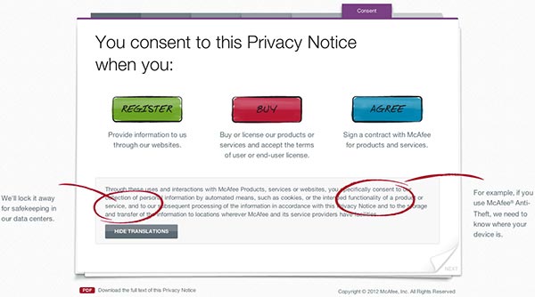
Screenshot of the storybook format with helpful explanations
Half-jokingly, we threw a ninja into the presentation. "A comic ninja who explains the legalese — wouldn't that be hilarious?" Maybe it would be too flippant. McAfee was a serious company, after all, and privacy isn't a trivial subject. But the ninja stayed. Why not?
To our surprise (and her delight), Michelle loved the ninja idea most.
New Ideas Need Extra Development
This format was the first of its kind, and by risking something new, we had to discover new conventions. So we took an extra week to second-guess the ideas and test assumptions. Several iterations later we settled on a storybook-like format. It was easy for users to learn and — most importantly — approachable.
The more we riffed on the concept of a fictional privacy ninja, the more unusual — yet plausible — our ideas became. The project became more than a single document. We explored:
- A "build your own ninja" tool
- The option for users to choose a character to defend their rights — super hero, ninja, or security guard
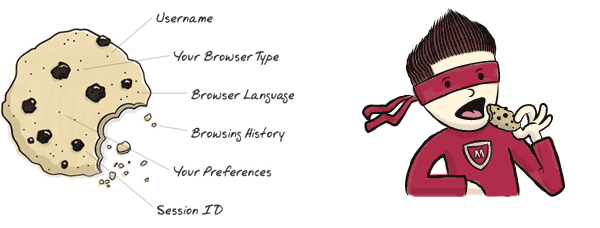
- Using the ninja as content, not decoration. More infographic, less clip art in the margin.

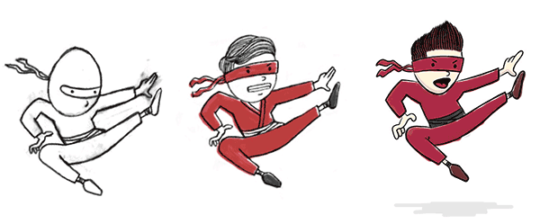
We went through a few iterations before finalizing on the ninja illustration.
Versions of the ninja became less cartoony, more realistic. But in the end we opted for our original simple cartoon that almost didn't make it into the presentation.
Unusual Ideas Need Support Before and During Iteration
While Michelle loved the unorthodox idea, we wondered how to propose it to others. How would they take it? Once again, we found that wondering about rejection was needless worry.
When Michelle presented the ninja idea to her boss, she was careful to explain that the "cartoons" were a means of communication, not a means of making the policy seem childish.

More than extras on the side, cartoons illustrated important concepts to users.
She also took the idea to the Federal Trade Commission. She said companies preemptively telling the FTC, "I"m taking a risk," was unusual. In this case, it worked. The FTC had never seen anything so creative in a policy — and they liked what they saw.
Michelle returned to McAfee with outside acceptance. The risk of a cartoon ninja — an afterthought and half-serious cartoon — was paying off.
Risks Pay Off in Unexpected Ways
Originally, we agreed that concepts and mockups would be our final deliverables. But later McAfee asked us to build out a working prototype storybook. Over two weeks we created a single-page microsite with animated, jQuery-based "pages." At the time, no one else had created reliable animation for the particular look we wanted, so the project's lead engineer took a risk and wrote his own.
Part of taking risks in design is knowing when they're appropriate. Storybook or not, the policy was a legally binding document. The legal team was adamant on certain phrasing. But while the legal text remained essentially the same, our new format organized it into easily digestible chunks. Graphics showed what text meant. And the ninja illustrations made the document approachable.
It pays to question assumptions. Even if the ninja hadn't panned out, it got us thinking. By suggesting "crazy"'ideas, we were able to open up the problem, break away from convention, and deliver something unique. You never know when a bad idea will lead to a great one. Like ninjas, great ideas don't appear unless you're willing to risk looking for them.
