More than a year ago we began a comprehensive redesign of
TinyPic.com, sister site of
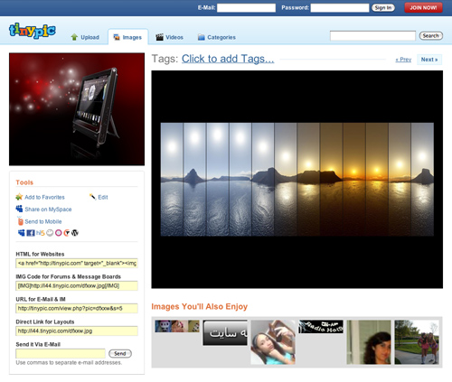
Photobucket. As a free image and video uploading and sharing service, we faced a unique task of handling several requirements in our redesign. After several iterations, we ended up very happy with an improved two-column layout for viewing images.
Imageshack, longtime competitor of TinyPic, recently redesigned their full view page, too. And it looks just like TinyPic—save for a few "changes" their team made.
When we designed this page, we went through several different layouts including different columns, ad placements, image/video sizes, and most importantly the calls to action. That's where this design really took off for us. We had three goals in mind for the page when we started:
1. Continue to monetize the page by serving up ads
2. Ensure that the media (image or video) comes first and foremost
3. Encourage sharing and uploading
We nailed each goal with this design. In our experience (with TinyPic and others), we have had **a lot of success using med recs** on ad-driven services. Even better, the large size of the images and video player, along with the "quick browse" at the bottom of the page, makes sure we're *always* thinking about *your* stuff. And with the unique toolbox area in the left column, along with an inline uploader for signed in members, **sharing and uploading is our priority at all times**.
TinyPic has some great minds behind the scenes, able to constantly improve the service, which is exactly what we've been helping them do. Their related images, the fast servers, unique tools (sharing, links, actions, etc) the cross-browser support, and much more give them the tools to pull
this kind of layout off. However, **Imageshack isn't able to create a sustainable environment** on these pages. Tabs, ads, and random images make it rather dull, literally not what I want to see when looking at images online.
The fact that one of the other heavyweights in the same market as TinyPic has virtually duplicated our design shows that we did something right and—dare I say—*revolutionary* with our work. Moreover, our client's competitors are now trying to play catch up :).
 Imageshack copies the layout and adds tabs, lots of inappropriate "related" images, and poor negative spacing.


 Imageshack copies the layout and adds tabs, lots of inappropriate "related" images, and poor negative spacing.