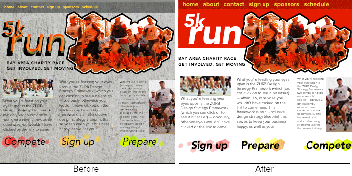
With the rise of Windows 8's UI (formerly Metro) and the upcoming iOS7 UI, it seems like web design is going flat. But we don't think textures are finished yet. Here's how you can use the ideas behind skeuomorphic interfaces and flat's sensibilities.
Flat designs are popular today for a reason: They work well in responsive web designs, and people don't need skeuomorphic hints anymore. But that doesn't mean we should ignore photo-realistic design elements — to say nothing of photos themselves. Here's how to use flat and skeuomorphism together in three minutes.
1. Remove every image from the site.
Remove images after you back up your website's files and database. (Safety first, you know.) Take out the photos, icons, textures, background images, etc. No JPGs, no PNGs, SVGs, videos. If it uses <img> or { background }, either replace them with an appropriate flat color or remove them altogether.

It's OK to let bits of text — like "get involved, get moving" — overlap areas of color. At this point we want usable, not beautiful.
Changing images to flat colors shows how essential the art was. And that's a key point: We appreciate what images contribute when they're gone. We've lost grit. We've lost motion. It's the motion that matters — we want people to sign up and race. Keep that in mind …
2. Bring back images that matter.
So the page looks weird. That's OK. Here's the key — bring back one image at a time until users can navigate the site and make sense of its content.

Replace the main art. Hold it — that sense of motion returns after only one image. The rest of the page is static, but let's resist adding more.
We could argue the "road grit" theme is important, but motion trumps that. The site's about getting people to sign up and run. The minimum example also bumps up the contrast with a pure white background.
3. Base your decisions on context.
Once you've reached a level of "good enough," re-introduce visuals that return the site's character.
- Start with flat colors. If that works, move on.
- If not, try a monochromatic image. If that works, move on.
- Use colorful images only when you want to highlight key points on each page.

Finally, we experiment with the "flat" design.
Version 1 goes even simpler, organizing three sections with background color. The calls to action are practically their own page. Can't miss 'em now.
Version 2's bold, white "5k run" really pops, giving users a place to start. It helps that the photo's red tones blend into the background. Low contrast is not necessarily low saturation.
Version 3 might a little too far. The extra photos give visual interest but don't tell users anything new. We saw people running at the top. OK. Got it. If you add photos or textures, make sure each one contributes something new.
Version 3 also lets the hero image step out of its red box. The result: better integration all around. Sudden background changes create boundaries. That's great for organizing, but remember we want things to flow.
One more thing. After simplifying the calls to action, we noticed they were out of order. Oops. Version 3 puts calls in the same order people should act — and uses the original teaser's "motion" graphics to emphasize moving from one step to the next.

The final version is more effective because it uses complex visuals intelligently. That means, more specifically, complex art to grab attention and create mood, but only where they're needed. And that's the heart of skeuminimalism. It's not flat for flat's sake. It's using imagery to your advantage.
Get More Lessons Like This in Your Inbox
A few years ago Bryan, our chief instigator, figured out that not all education comes in full, formal lectures. He led a series of quick design education sessions — about three minutes long each — to get the team jazzed about design.
In that spirit, we've started building a library of how-tos and techniques based on our 15 years of product design experience. These lessons will give you all the methods and processes you need to be trained as a product designer — you can learn about topics including:
- Analytics
- Brainstorming
- Front-end coding
- Design Reports
- Product Strategy
- Prototyping
- Responsive Web Design
- User Research
- User Testing
- Visual Design
- Wireframing
- Sketching