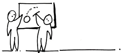
This may sound nutty but here at ZURB, you'll often find us standing at whiteboards to think out design problems. In fact, we have 19 of them scattered about the office. Although sitting down to talk things through might be more comfortable, designing while standing is an awesome way to create great results.
The stand-up design method really gets the blood flowing because it actually forces your blood to circulate through your body and brain, and gets the neurons firing creative thoughts. People interact with your websites in noisy homes, at coffee shops, and over smart phones in public. They're active and fickle. Standing while designing helps you match their actions and keep your energy up while designing. More often than not that energy shows in a more inspired, dynamic, free-flowing end result.
Getting away from your desk lowers your guard
It's subtle, but desks are homebase. They're territory. People feel ownership over them and social rules apply for who and how people can approach you in that space. When you stand and work away from your desk you enter into shared space. You're more approachable and open to feedback. Below is a great example of how getting in a neutral space encourages others to give feedback on a design.

Standing is social
When you get away from your desk, it's easier for others to gather around you. ZURB has a big work table with enough room for 3-4 people to spread out and work. This gets ideas flowing between people.
Standing up while designing gives you a whole new perspective on your project. It's funny, but the scale of an idea influences how you think about it, and whiteboards give you a large space to work in instead of a small rectangular computer monitor. Below is a great time lapse video example from our 24hour ZURBwired that shows people working in clusters.
Whiteboards promote standing
It invites standing, animated/energetic work, and is fundamentally social. Most great work and great conversation happens in the hallway or around the water cooler, not in meetings. Having work on whiteboards makes it easy for others to approach what you're doing. Two, three, and four or more people can gather around and participate. New things can start to click. Getting other people invested in a design is much easier at a board.
It also keeps you from typing ideas on a keyboard, which constrains thinking. Instead, using large hand movements while standing in front of a whiteboard produces unexpected results. Skip the details, just focus on broad concepts.
Just stand up
The next time you need to jumpstart a design project, put up a whiteboard on the wall. It's a surprisingly effective way to collect and organize ideas.


